// article
Missing the Best Months
Sitting out the best months is expensive, and the worst months are next door
A dollar in the S&P 500 in 1871, with dividends reinvested, became about 634,681 dollars by mid-2023. Miss only the five best months of those one hundred and fifty years, and two-thirds of that fortune never shows up. The cliche says time in the market beats timing the market. On this data the cliche is right, and the reason it is right is not the one usually given.
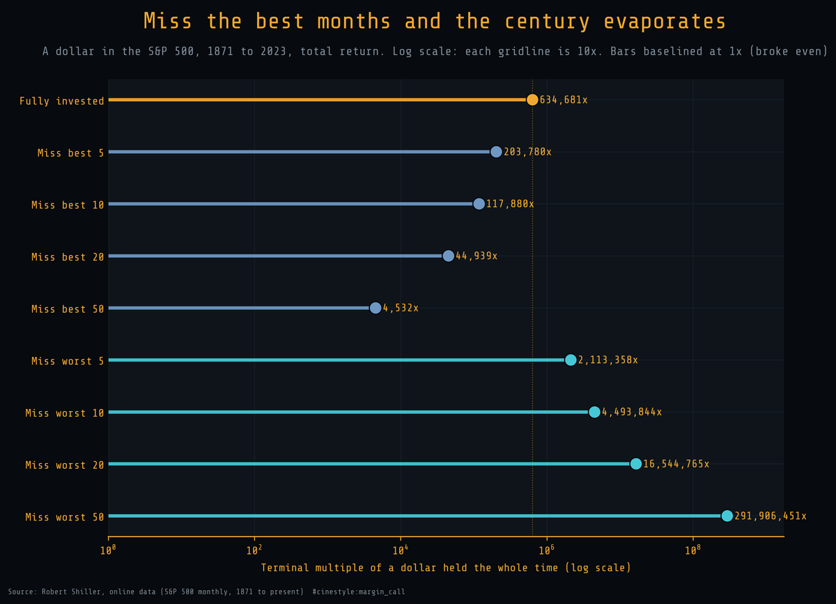
Each rung is one strategy. The top rung holds the whole time and ends at 634,681 times its money. Drop the best five months into cash, and it falls to 203,780. Drop the best fifty, and 634,681 collapses to 4,532. Sit out the worst months instead, and the line runs the other way, off the right edge of the chart. The axis is logarithmic, and it has to be: no honest linear axis can show a number that ranges from four thousand to three hundred million in one frame. Each gridline is a factor of ten.
One honesty note before the numbers. This is monthly data, not daily. The usual version of this chart counts best and worst days, which this Shiller feed cannot give me. So every claim here is about months. The lesson does not change, but the units do, and I am not going to pretend otherwise.
What the feed is, and where I stopped
The data is Robert Shiller’s monthly S&P 500 record, 1865 rows from January 1871 through May 2026. I build a total return from the raw columns rather than trusting a prebuilt one. The monthly gross return is the price this month plus one-twelfth of last month’s annualized dividend, divided by last month’s price. That captures both the price move and the income an investor actually pocketed.
The feed carries the price forward every month but enters dividends on a lag, so the most recent thirty-five rows report a zero dividend. A total return needs the income leg, so my series stops in June 2023, the last month with a real dividend. I did not invent the missing payouts. That leaves 1829 monthly returns spanning 152.3 years, which is the panel every number below comes from.
Missing the best months, in order
Rank all 1829 months by return and pull out the top handful. The damage compounds fast.
- Miss the best 5 months: 203,780x, down to 32 percent of fully invested.
- Miss the best 10: 117,880x, 19 percent.
- Miss the best 20: 44,939x, 7 percent.
- Miss the best 50: 4,532x, under 1 percent.
Missing twenty of 1,829 months, roughly one in ninety, throws away ninety-three percent of the final wealth. The market does not deliver its return in a smooth drip. It delivers it in a few violent up months, and the rest of the time it mostly treads water. Miss the violent up months and you are left holding the water.
The cliche skips the other half: the worst months matter as much as the best ones.
The worst months cut just as deep, the other way
Run the same exercise on the worst months and the terminal wealth explodes upward.
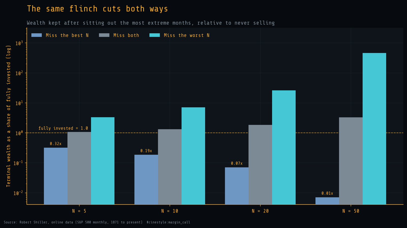
Dodging the worst five months lifts the dollar from 634,681 to 2.1 million. Dodging the worst fifty pushes it past 291 million. The best-months penalty and the worst-months bonus come from the same fact, that the extremes in both directions do almost all the work, though they are not symmetric. Missing the best twenty keeps about 7 percent of the result; skipping the worst twenty multiplies it by 26. A market timer who could reliably skip the worst months would be rich beyond the chart. A market timer who skips the best by mistake ends up poor. The honest question is whether anyone can tell the two apart in advance, and the next figure is why I think the answer is no.
Per year, it looks survivable, which is the trap
The multiples are lurid. Translate them into the annual return a saver actually feels and the danger hides better.
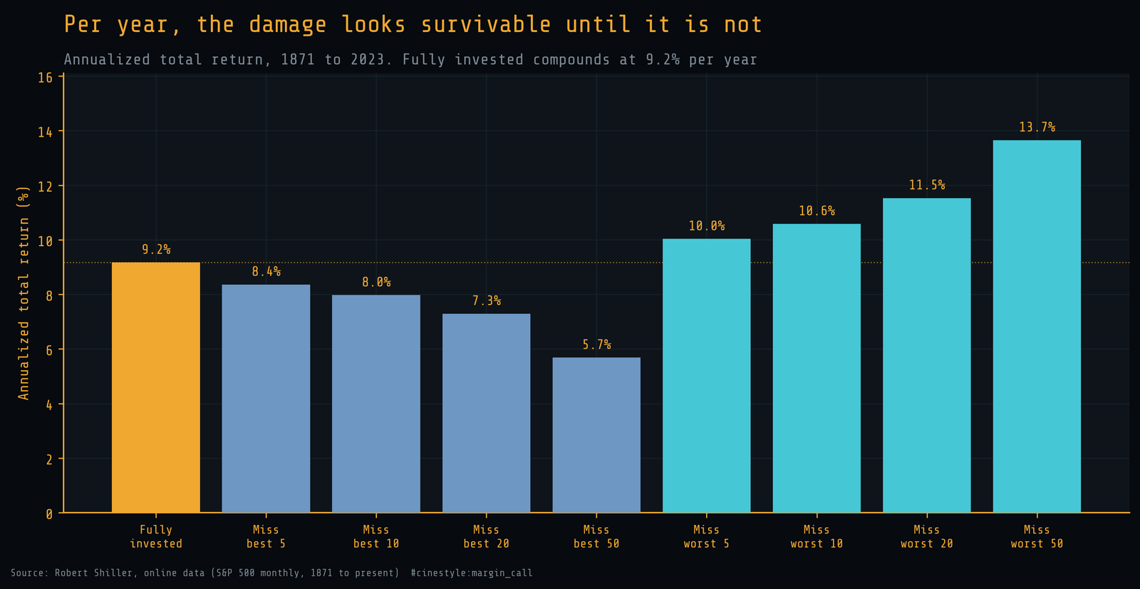
Fully invested compounds at 9.2 percent per year. Miss the best five months and that becomes 8.4 percent. Miss the best fifty, the move that destroyed ninety-nine percent of the wealth, and you still earn 5.7 percent per year. Five point seven percent sounds like a return you would accept, which is the trap. A small annual shortfall, repeated across a century and a half, is the difference between 634,681 and 4,532. Compounding does not announce its losses. It just stops being a fortune.
The best and worst months share an address
Now the finding that decides the whole argument. If the best and worst months landed in different, recognizable regimes, timing might be tractable. They do not; they land on top of each other.
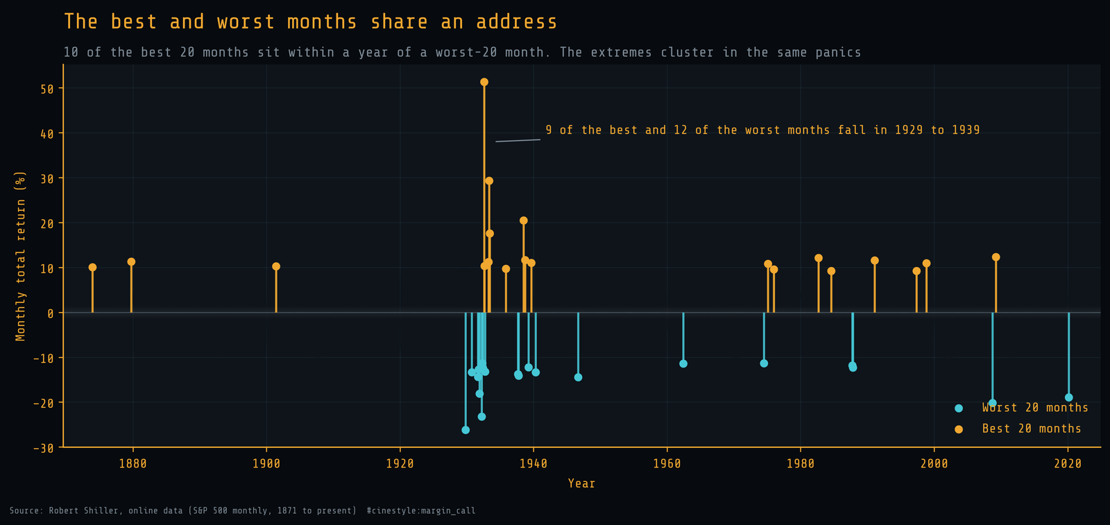
Ten of the twenty best months sit within a single year of one of the twenty worst months. Nine of the best twenty and twelve of the worst twenty fall inside the same eleven-year stretch, 1929 through 1939. The biggest up months and the biggest down months are neighbors in time, not opposites. The market’s most violent rallies happen in the middle of its most violent crashes, often within a year of each other, when fear and relief are trading the same panicked tape.
This is what kills market timing as a plan. To skip the worst months you have to be out during exactly the periods that also contain the best months. The 1933 surge that delivered some of the best returns in the record arrived while the Depression was still grinding through its worst returns. You cannot catch one and dodge the other, because they are the same storm. Get scared out before the crash and you also miss the rebound.
There is one result in the run that cuts the other way, and I would rather show it than hide it. Sit out both the best twenty and the worst twenty and you end with 1.85 times the fully invested result. On paper, a timer who stepped aside for the whole storm wins. In practice that timer has to know in advance which months belong to the storm, which is the same foresight the rest of this post says nobody has.
The honest takeaway
So the cliche survives, but for a sharper reason than patience. Time in the market wins not because the market always rises, but because its gains are concentrated in a few months that sit inside the scariest stretches, indistinguishable in advance from the months that lose the most. Missing the best twenty months costs you ninety-three percent of the result. Skipping the worst twenty would have left you with 26 times the fully invested result, if you could have picked them out. You cannot, because they share a street with the best twenty.
The defensible move is the boring one. Hold through the panic, because the panic is where the return lives.