// article
Premiums and Road Risk
Higher insurance premiums do not mean more dangerous roads
I went in expecting the boring result. States with deadlier roads should pay more for car insurance. Actuaries price risk; more crashes mean more risk, so premiums climb. Then I ran the correlation and the sign was wrong.
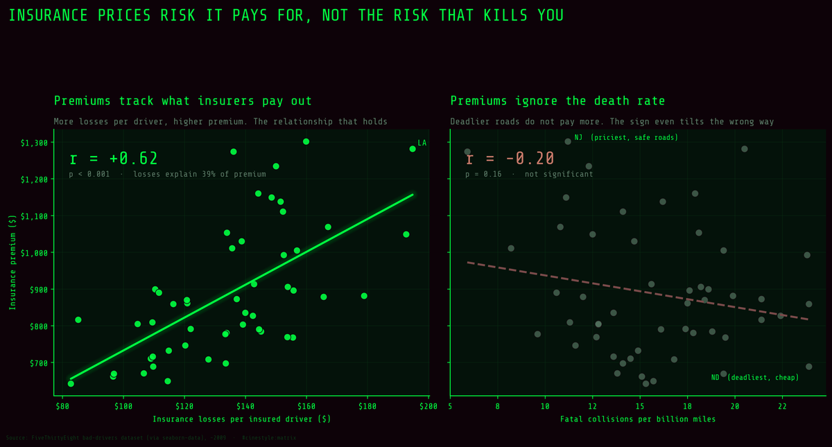
The two panels share a y-axis and tell different stories. Premium rises with what insurers actually pay out, and losses explain about 39% of its variance. The fatal-crash rate explains 4%. The right-hand panel looks like pricing is broken. The left panel shows it working as designed, just not on the variable you assumed.
The data is FiveThirtyEight’s bad-drivers table via seaborn-data: 51 rows, 50 states plus DC. The crash columns come mostly from NHTSA 2012 (speeding from 2009), and the insurance columns from NAIC 2010 and 2011. Across those rows, the Pearson correlation between annual insurance premium and the fatal-collision rate is -0.20, and it is not significant (p = 0.16). Spearman agrees and is weaker still at -0.118. The states that crash the most are not the states that pay the most; if anything the line tilts the other way.
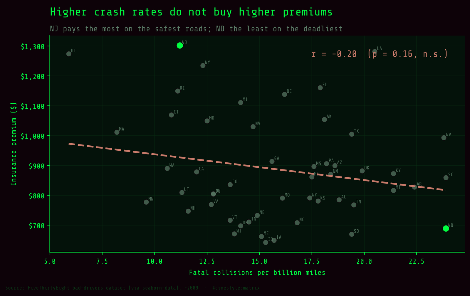
Look at the corners of that scatter. New Jersey pays the most, $1,301.52, on roads with 11.2 drivers in fatal crashes per billion miles. North Dakota ties South Carolina for the worst rate in the country at 23.9 and pays $688.75. So what does premium track? Payouts, the thing it is supposed to. Premium against insurance losses per driver comes in at r = 0.623 (p < 0.001). And losses themselves have nothing to do with the death rate: r = -0.036, p = 0.80. My guess is that payouts are dominated by frequent, expensive property-damage claims in dense places rather than by rural fatalities, but this table cannot test that. What it does show is that the premium knows about one kind of dangerous and not the other.
The rest of the dataset has its own trap, and it sits in how the behavior columns are stored.
A share is not a rate
FiveThirtyEight publishes four behavior columns as percentages: of the drivers involved in fatal crashes, what share were speeding, alcohol-impaired, not distracted, or had no previous accidents. The seaborn copy does not store those percentages. It stores each one multiplied by the total, so speeding is speeding-involved drivers per billion miles. Hawaii’s 9.45 is its total of 17.5 times its 54% speeding share. You can recover the share by dividing by total, and you should know which one you are holding before you rank anything. The four columns are overlapping slices of the total, not a partition of it; they sum to 37.46 per state on average.
Picture each state’s fatal crashes as a pie. The share says how the pie is sliced. The rate says how big the slice is, which depends on the size of the whole pie. Store the slice size and every column inherits the pie’s size. Take no_previous. As a rate it correlates with the total at r = 0.956, which looks like a finding about clean-record drivers. It is not. The share sits between 76% and 100% in every state, so the rate column is nearly a copy of the total. Correlate the share itself with the total and you get r = -0.018. not_distracted does the same: 0.828 as a rate, 0.01 as a share. The rate columns are the total wearing different labels.
Mississippi shows why the share still matters. Its not-distracted share is 10%, the lowest in the set, against a median of 88%. As a rate that becomes 1.76 per billion miles, which buries the oddity inside a state with an ordinary-looking total of 17.6. Ten percent of drivers in fatal crashes recorded as not distracted is a reporting quirk, not a driving pattern, and only the share makes it visible.
The ranking that flips when you change the units
Neither unit is wrong. They answer different questions. The share asks what goes wrong when a state’s drivers crash. The rate asks how often that particular thing kills people per mile driven. Rank by one and then the other, and the worst-state lists reshuffle.
Speeding shows it clearly. Hawaii leads on both: 54% of drivers in its fatal crashes were speeding, and at 9.45 per billion miles it also has the highest speeding rate. Below Hawaii and Pennsylvania the lists part ways. Connecticut is third by share at 46%, but its overall rate is only 10.8, so it falls to 22nd by rate. South Carolina runs the other way: 13th by share at 38%, third by rate at 9.08, because its total of 23.9 is the worst in the country. The Spearman correlation between the two speeding rankings is 0.785.
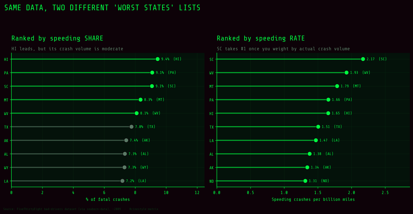
The understated direction is the one that matters for policy. West Virginia ranks 25th by speeding share, at 34%, which reads as unremarkable. Its total of 23.8 lifts it to fifth by rate. A policymaker ranking states by the share would pass over West Virginia and chase Connecticut. If the goal is fewer deaths per mile, the rate says do the reverse.
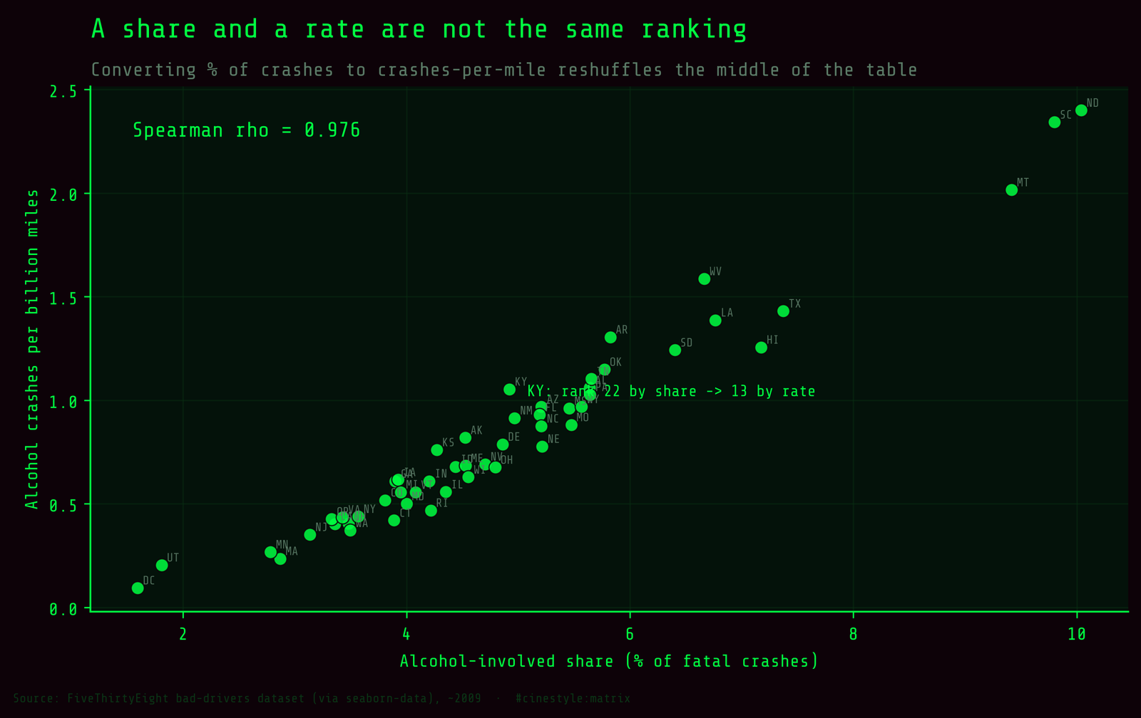
Alcohol disagrees even more. The Spearman between the share ranking and the rate ranking is only 0.443. The worst states, North Dakota, South Carolina and Montana, sit near the top of both lists because they have high shares and high totals. The middle churns hard. Arkansas has one of the lowest alcohol shares, 26%, ranked 45th, and one of the highest alcohol rates, 5.82, ranked 9th, carried by a total of 22.4. Massachusetts goes the other way, eighth by share at 35% and 48th by rate at 2.87, because its roads are among the safest in the set. Whenever a state’s share and its total disagree, the ranking depends entirely on which column you picked.
What this dataset cannot tell you
This is 51 data points, one cross-sectional snapshot, aggregated to the state level. Everything here is ecological. A correlation across states is not a statement about any driver, and the premium result especially is confounded by urban density, no-fault laws, uninsured-motorist rates, theft, and weather. I am not claiming expensive-insurance states are safer. I am claiming that the obvious read, that premium tracks fatal-crash risk, is contradicted by the sign of the correlation, and that the behavior columns in this dataset mean different things depending on whether you divide by the total.
Before you rank anything, read the column definitions in the original source, not the copy.