// article
Two Americas of Driving Risk
Two Americas of driving risk, and the insurer charges them the same
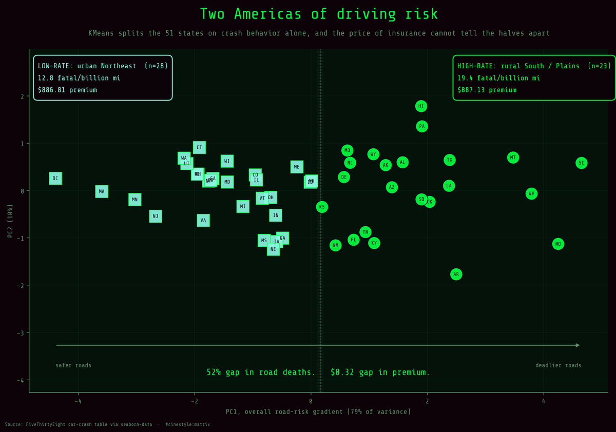
Let an algorithm sort the country on crash behavior alone and it carves out two halves, one low-rate and one high-rate. The deadlier half kills people on the road 52% faster. The two halves pay for insurance within 32 cents of each other.
Split the 50 states plus DC into two driving-risk groups and the gap is wide. One cluster averages 19.45 drivers in fatal crashes per billion miles, the other 12.79, a 52% difference in how lethal the roads are. The average annual insurance premium in those two groups is $887.13 against $886.81, thirty-two cents apart.
I was not fishing for that. I came to this dataset wanting to see whether the states sort into clean driving-risk profiles on their own, without me hand-picking a North-versus-South story. So I let KMeans do the splitting and only looked at premiums afterward. The premium tie fell out as a byproduct, and it is the result I keep staring at.
The setup
The data is FiveThirtyEight’s bad-drivers table via seaborn-data, 51 rows (50 states plus DC). The crash columns come mostly from NHTSA 2012, with speeding from 2009; premiums and losses come from NAIC 2011 and 2010. I clustered on five columns: total (drivers in fatal crashes per billion miles) plus speeding, alcohol, not_distracted, and no_previous. One thing to know before reading anything below: all five are rates. FiveThirtyEight publishes the four behavior columns as percentages of the drivers in fatal crashes, and the seaborn copy stores each percentage multiplied by total. So every behavior column carries the total rate inside it. I standardized all five before clustering so no single column’s scale dominates the distance math, but those four columns are built from total, and the clustering is really separating states along one dominant axis.
PCA confirms that the five columns point the same way. The first principal component alone takes 79% of the variance, and every feature loads on it with the same sign (total 0.484, no_previous 0.463, alcohol 0.458, not_distracted 0.442, speeding 0.381). The second component adds only 10.5%. That is not five independent risk dimensions. It is one “how bad are this state’s roads” gradient with a little texture on top, and the texture is what the percentages add once the total is factored in.
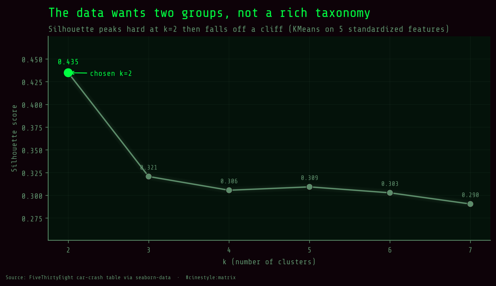
So I did not oversell the structure. I asked for k from 2 to 7 and let the silhouette score pick. It peaked at k=2 (0.4348) and fell off for everything else: 0.3207 at k=3, around 0.30 for k=4 through 7. The inertia curve gives no competing answer: it falls steadily from 116.93 at k=2 to 42.6 at k=7 with no sharp elbow. With n=51, the honest two beats a prettier three.
Who is in which bucket
The low-rate cluster has 28 states. The high-rate cluster has 23. Geography was never an input, and the map it produces is only partly the one you would guess.
The high-rate group leans South and Plains: Alabama, Arkansas, Louisiana, South Carolina, Tennessee, Oklahoma, Texas, the Dakotas, Montana, Wyoming, New Mexico. It also holds Alaska, Hawaii, Florida, Delaware, Pennsylvania, North Carolina, Kentucky, Kansas and Missouri. The states closest to its centroid, the most typical members, are SD, OK, AZ, AL, and TX. Its averages run hot on every behavior column: 6.49 speeding-involved drivers per billion miles against 3.77 in the other group, and 6.19 alcohol-impaired against 3.82.
The low-rate group holds the dense Northeast and the big urban states: New York, New Jersey, Massachusetts, Connecticut, Rhode Island, Maryland, California, Illinois, Michigan, Washington. It also holds much of the interior West and Midwest: Idaho, Utah, Colorado, Nevada, Iowa, Nebraska, Wisconsin, Indiana, plus Georgia, Maine and Vermont. Its most typical members are CA, NY, MD, OR, and NH. Mississippi lands here despite its reputation; the clustering goes on all five columns, not the stereotype.
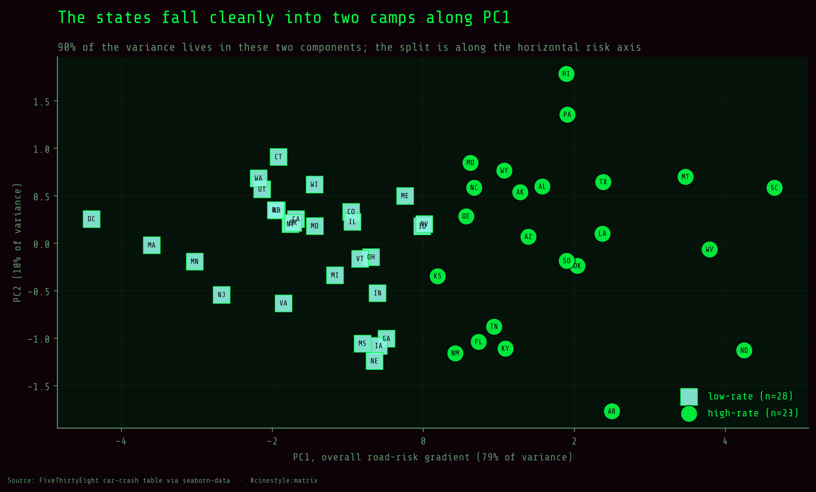
The scatter is what sold me on k=2 being real and not a convenience. The two clusters separate cleanly along PC1, the horizontal axis that is essentially “overall risk.” But the seam in the middle holds close calls, and a chunk of the low-rate states pile up near the boundary. A 0.4348 silhouette is moderate structure, not two planets. Read these as descriptive buckets with fuzzy edges, nothing more.
DC sits in the low-rate cluster, treated like the urban Northeast it resembles, even though it is a city and not a state.
The premium tie
Now the part I kept coming back to. Two clusters side by side: a 52% gap in fatal-crash rate, and a premium gap of 32 cents.
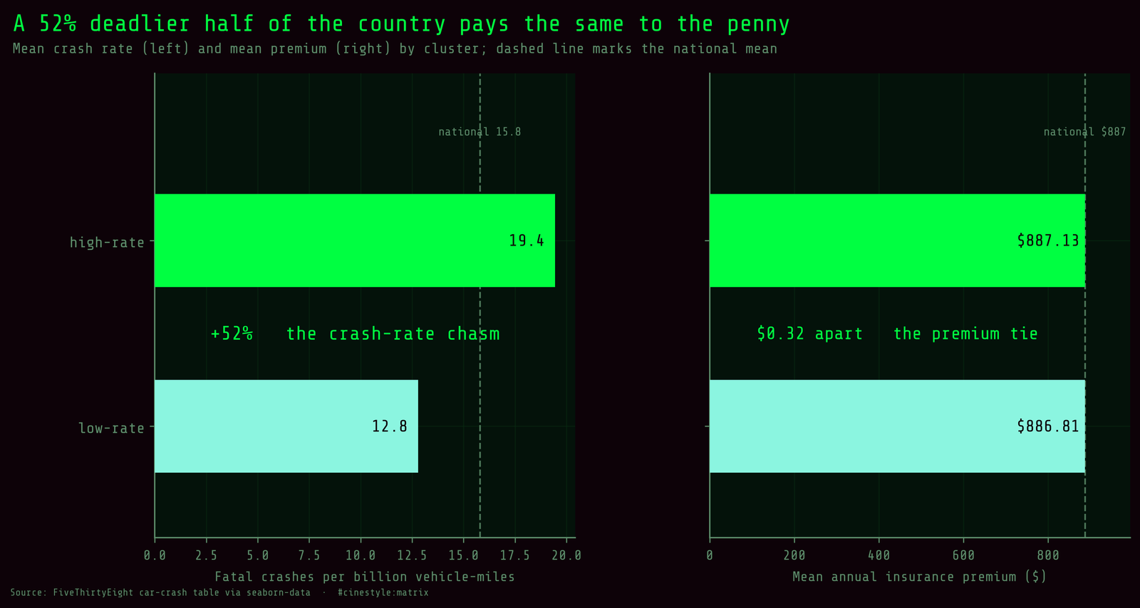
The left panel, crash rate, shows two clearly different bars straddling the national mean of 15.79. The right panel, premium, shows two bars at the same height, both sitting right on the national average of $886.96. If premiums tracked road lethality, that right panel should echo the left one. It does not. Insurance losses per driver barely move either, $136.30 in the high-rate group against $133.01 in the low-rate one, a rounding error next to the crash gap.
The grouping was driven entirely by crash behavior; the premium was never allowed to vote. You can carve the country into its safest and its deadliest driving halves using nothing but crash data, and the price of insurance will not tell the two halves apart.
The clustering does not explain why. Premiums price expected payouts, and the losses column shows payouts are nearly equal across the two groups. My guess is that property-damage claims in dense places cost insurers as much as the extra fatalities elsewhere, but nothing in this table measures claim types, so treat that as a hypothesis. What the data does show is that the premium is measuring something other than the crash rate.
So treat these two clusters as what they are: a descriptive split of 51 rows from one cross-sectional snapshot, not a causal map and not a verdict on any individual driver. If you had asked me to bet that the deadlier-roads half of the country pays more for car insurance, I would have lost. They pay within 32 cents of each other.