// article
The Accelerating CO2 Curve
The CO2 rise is speeding up, and the curvature is the story
In March 1958, the air on top of Mauna Loa held 315.7 ppm of carbon dioxide. In April 2020, the same instrument read 416.18. That is a 100.48 ppm jump, a 31.8% increase over 62 years from one instrument on one mountain. I went in expecting a straight line going up. The line is real, and it bends upward.
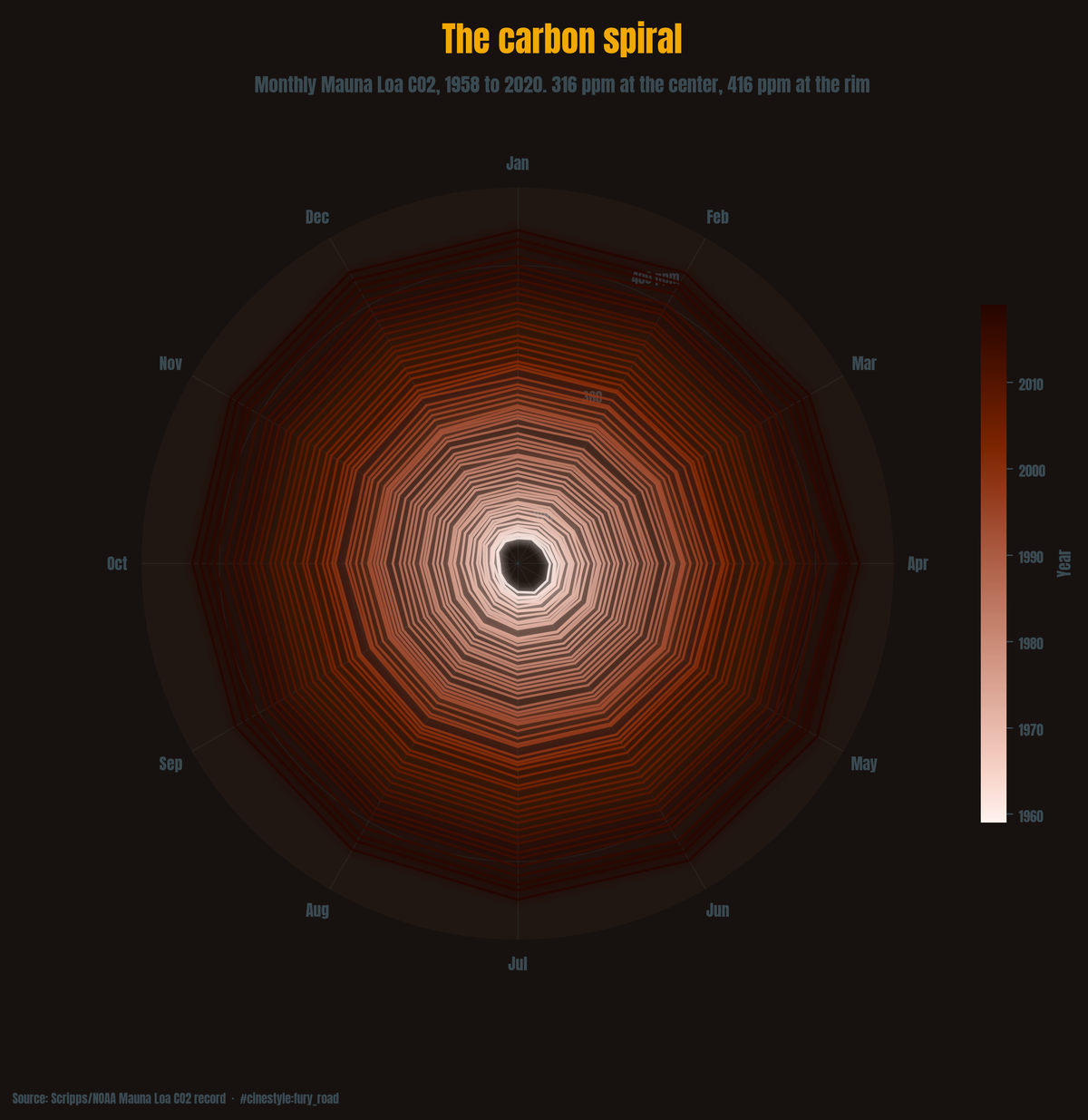
Each ring above is one year of monthly readings. The spiral pushes outward because every year sits further from the center than the last.
The data is the Keeling curve: 741 monthly observations from Scripps/NOAA’s Mauna Loa station (via vega-datasets), running 1958-03 to 2020-04. Three columns: date, raw CO2, and a seasonally adjusted CO2. It needed no cleaning, and it is one of the cleanest long time series you will ever load.
The straight line is a lie of convenience
Fit a plain linear trend and you get a slope of 1.577 ppm per year, with an R² of 0.977. That is a tempting number. It explains 98% of the variance, and you could stop there and call it a day.
Fit a quadratic instead and R² climbs to 0.994. Put the other way, the unexplained share of the variance drops from about 2.3% to 0.6%. The coefficient on the squared-time term is 0.0131 ppm per year-squared, with a standard error of 0.000286 and a t-statistic of 45.7. That t-statistic is inflated: ordinary least squares assumes each month’s error is independent of the next, and in a monthly series with a seasonal cycle they are not. Even discounted heavily, the curvature is not noise, and the decade slopes below confirm it without any model assumptions.
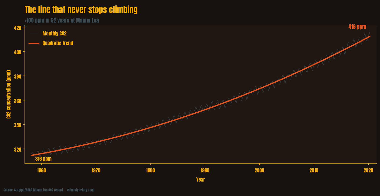
The red line in that figure is the quadratic. It hugs the data so tightly that the only daylight between fit and reality is the seasonal jitter riding on top. The average slope of 1.577 ppm/yr matches the 1980s and 1990s and misses both ends of the record.
How fast is “accelerating”?
I split the record into decades and fit a separate slope to each. This is where the abstraction becomes concrete:
- 1960s: 0.77 ppm/yr
- 1970s: 1.20 ppm/yr
- 1980s: 1.54 ppm/yr
- 1990s: 1.53 ppm/yr
- 2000s: 1.98 ppm/yr
- 2010s: 2.39 ppm/yr
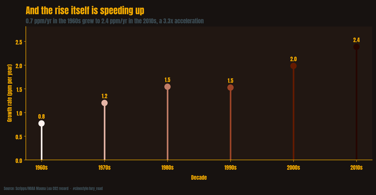
Compare the first full decade of the record to the last. From 1959 through 1968, CO2 rose 0.713 ppm per year. From 2010 through 2019, it rose 2.385. The annual rate more than tripled, 3.35 times faster.
The picture is not perfectly monotonic. The 1990s came in fractionally below the 1980s, 1.526 against 1.544. I sat with that for a while. It is small, well within the slop you expect from decade-to-decade variability, and a sharp eye will spot it in the bar chart. I am leaving it in, because the honest picture has a dent in it and the dent does not change the conclusion. Every year now adds more than three of the old years’ worth of carbon.
The planet is breathing
The raw curve is not smooth. It wobbles up and down every single year, a sawtooth riding the trend. That wobble is the seasonal cycle, and you can pull it out cleanly by subtracting the adjusted column from the raw one.
Average that residual by calendar month and the rhythm is clear. CO2 peaks in May, sitting +3.10 ppm above the annual mean, and bottoms out in October at −3.31. Peak to trough, the swing is 6.41 ppm.
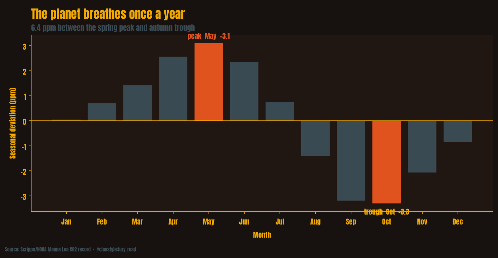
This is the Northern Hemisphere’s forests inhaling and exhaling. Through spring and summer, leaves photosynthesize and pull carbon down, and the curve falls into its autumn low. Through fall and winter, plants and soils respire it back out and the curve climbs to its spring high. There is more land, and more vegetation, north of the equator, so the global signal follows the northern growing season. May is the moment right before the leaves kick in. October is right after they have done their year’s work.
What gets me is the scale. The breathing amplitude is 6.41 ppm. The total rise over the record is 100.48 ppm. The planet’s entire annual inhale-exhale is about a fifteenth of what we have added since 1958, and a single recent year’s increase of 2.39 ppm is more than a third of the full 6.41 ppm seasonal swing. Each year’s peak sits higher than the last one, and the whole sawtooth ratchets upward about 2.4 ppm a year. The planet breathes, and the breath keeps starting from a higher place.
One station, one mountain
This is one station. Everything above comes from a single instrument on a single Hawaiian volcano, and I should say that out loud. But Mauna Loa is the canonical record precisely because its remote, high-altitude air is well-mixed and free of local contamination, which is why Keeling put it there in 1958. This particular dataset ends in April 2020, so nothing here describes the level today.
I started this looking for a trend line. I found a curve that bends upward, a growth rate that went from 0.713 to 2.385 ppm a year over the 62 years of the record, and a seasonal heartbeat the trend is slowly drowning out. The quadratic, not the straight line, is the honest summary.