// article
Cross-Asset Correlation
When the market breaks, stocks and oil stop diversifying each other
A diversified book is a bet that your positions will not all move the same way at once. That bet pays off in calm markets and gets called in crises, though not always in the way the trading-desk cliche says. From 1990 to 2026, the typical mean absolute correlation across the S&P 500, gold, Brent crude, and the US 10-year yield was 0.29. It did not reliably jump when markets crashed. The pair that did was stocks and oil, which spend most of the record ignoring each other and reached 0.85 at the 2008 peak and 0.91 in 2020.
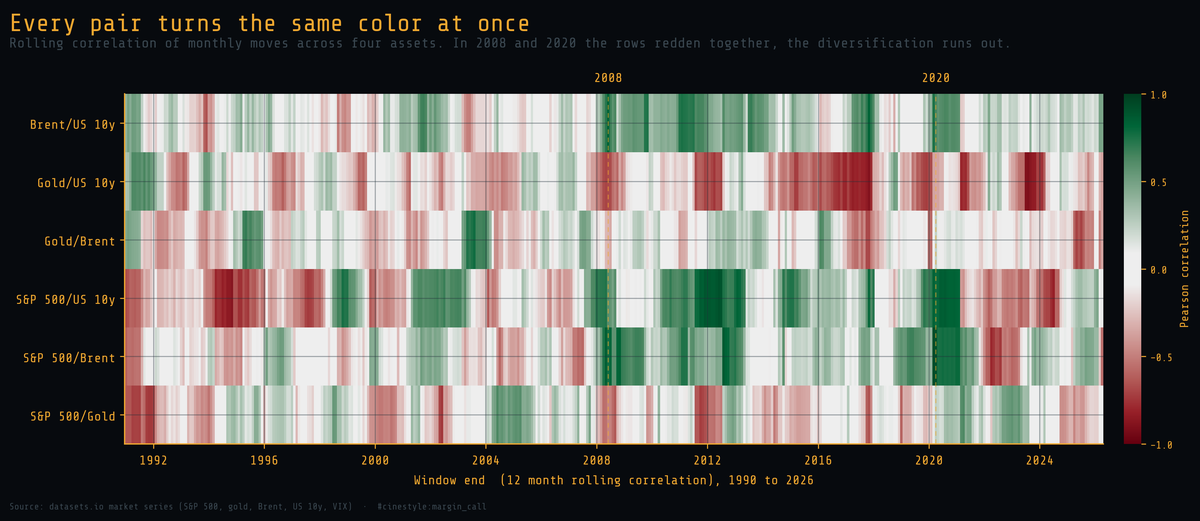
Each row above is one pair of assets. Each column is a 12-month window. Green means the pair moved together, red means they moved apart, and the scale is pinned to the full range from minus one to one so the neutral middle reads as no relationship. Watch the S&P 500/Brent row. In 2008 and again in 2020 it turns deep green, while the rows around it keep their own mix of colors.
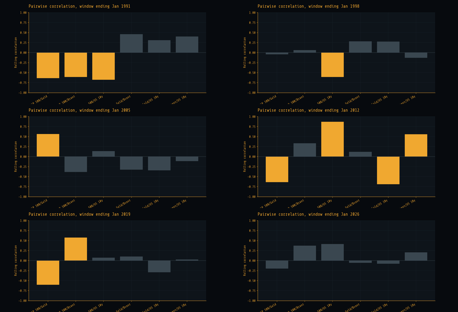
The same idea, pulsed through time, is in an animated version: each pair is a bar, and the bars swing as the windows roll forward.
The data is five market series from the datasets.io collection: the S&P 500, the London gold price, Brent crude, the US 10-year Treasury yield, and the VIX. I resampled all five to a common monthly index, took the month end value where the source was daily, and kept only the window where all five overlap. That window runs 1990-02 to 2026-04, which is 435 monthly observations. It is bounded on the left by the VIX, which only starts in 1990, and on the right by the bond series. It brackets both of the crises worth studying.
What I measured, and why these transforms
For stocks, gold, and oil I use the monthly percent return on the level. For the 10-year yield I use the monthly change in the yield itself, in percentage points, because a percent change of a number that already lives near zero is noise dressed as signal. The VIX I carry along as a crisis gauge, not as a correlated asset.
That leaves four assets and six pairs. The correlation I report everywhere is the Pearson correlation of those monthly moves inside a rolling 12-month window. Twelve months is long enough to be stable and short enough to see a regime change arrive. A shorter window screams; a longer one sleeps through the crisis you are trying to catch. The price of that choice is noise: each reading rests on 12 observations, so any single window, high or low, carries wide error bars.
Correlation is a number that moves
The textbook treats correlation as a fixed property of two assets. It is a window statistic, and it drifts.
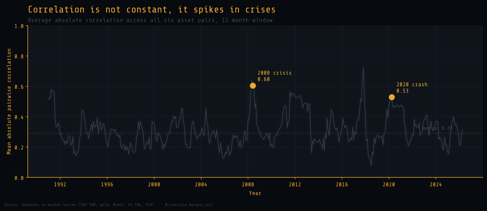
The line above is one number per month: the average absolute correlation across all six pairs, a single reading of how much everything is moving together right now. Its median is 0.29. Around the 2008 crisis it peaked at 0.64 in the window ending May 2008, about 2.2 times the median. In the 2020 crash it reached 0.53, about 1.8 times.
The 2008 peak is not the crash. A window ending in May 2008 covers mid-2007 to spring 2008, the run-up before Lehman. In the windows ending September 2008 through March 2009, the months of the actual crash, the average sits between 0.27 and 0.49, with a mean of 0.33. That is barely above the full-record median.
The single highest reading in the whole record is not a crisis either. It is 0.72 in late 2017, a stretch of quiet, everything-up markets where the assets happened to march together. A spike in the six-pair average is not a crash signature. High correlation in a bull market costs you nothing; the question is which correlations hold when a hedge has to work.
The same four assets, two different worlds
A static correlation matrix hides all of this, because it averages the calm decades and the violent months into one lukewarm number. Over the full sample, stocks and oil correlate at 0.19 and gold and the 10-year yield at minus 0.16. Neither number describes any period you would actually live through.
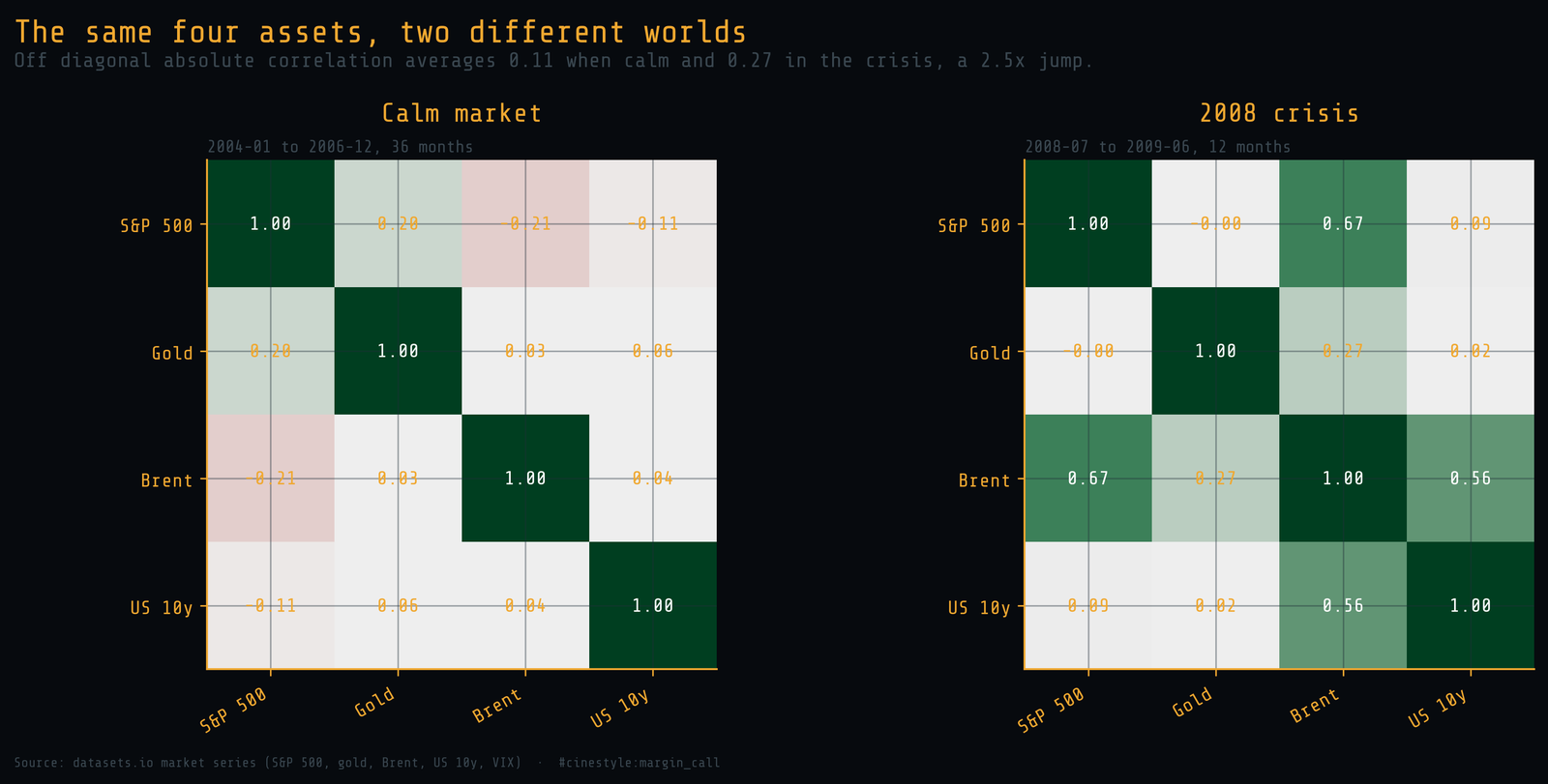
The left panel is the calm market from 2004-01 to 2006-12, 36 months of it. The off-diagonal correlations average 0.11 in absolute terms, and stocks and oil run slightly negative, the textbook diversification you were promised. The right panel is the twelve months from 2008-07 to 2009-06. The off-diagonal average moves to 0.27, which is still below the full-record median of 0.29. The average hides the cell that matters: stocks and oil go from minus 0.21 to plus 0.67. You do not get to choose which regime you are in when you need the hedge.
The pair that was never supposed to move together
Stocks and oil are the cleanest case, because for most of the record they genuinely are independent. Before 2008 the S&P 500 and Brent crude had a median rolling correlation of minus 0.05, effectively zero. They wandered, one driven by earnings and rates, the other by supply and demand for a barrel.
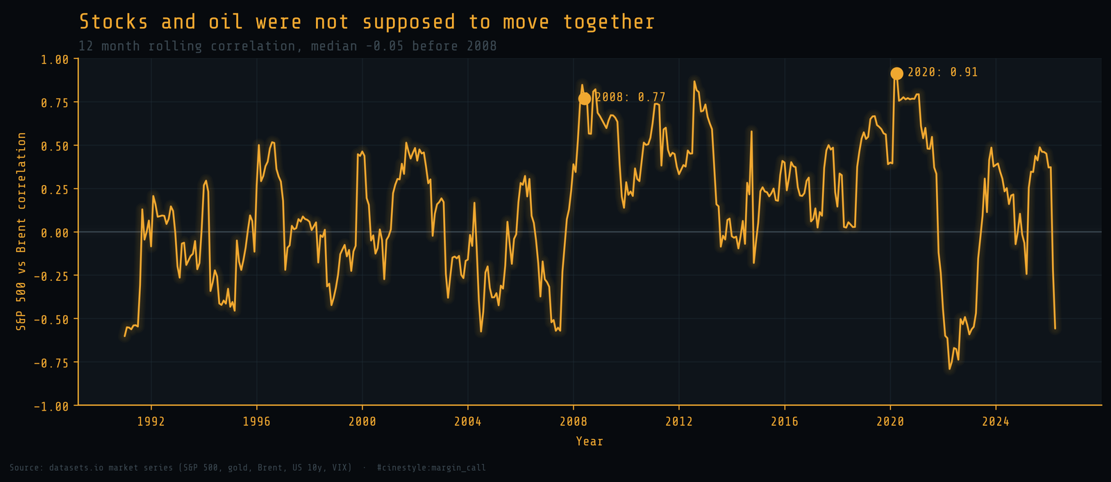
Then look at the two crisis dots. At the 2008 peak the stock and oil correlation hit 0.85. Through the crash windows it stayed high, never below 0.56 and averaging 0.69. At the worst of 2020 it hit 0.91. A correlation of 0.91 between equities and a commodity means they are, for that window, very nearly the same trade. In a liquidity panic, investors sell what they can, not what is overvalued, to raise cash and meet margin. The asset stops trading on its own fundamentals and starts trading on whether someone, somewhere, has to sell it today.
What this costs you
The practical lesson is narrower than the standard pitch, and harder to dodge. Your correlation estimate is a calm-market estimate. A stock and oil hedge backtested on 2004 to 2006 saw a correlation of minus 0.21. The 2008 to 2009 crisis window charged plus 0.67.
Two things follow. First, stress test a portfolio against crisis correlations pair by pair, not against full-sample averages or a six-pair mean, because the average blends regimes and can stay flat while the one pair you rely on flips. Second, the assets that hold their diversification through a panic are worth a premium, and you will not find them by reading a static correlation matrix. You find them by watching which rows stay their own color while stocks and oil turn green together.