// article
A Century of Disasters
Five years killed 44% of everyone who died in a natural disaster since 1900
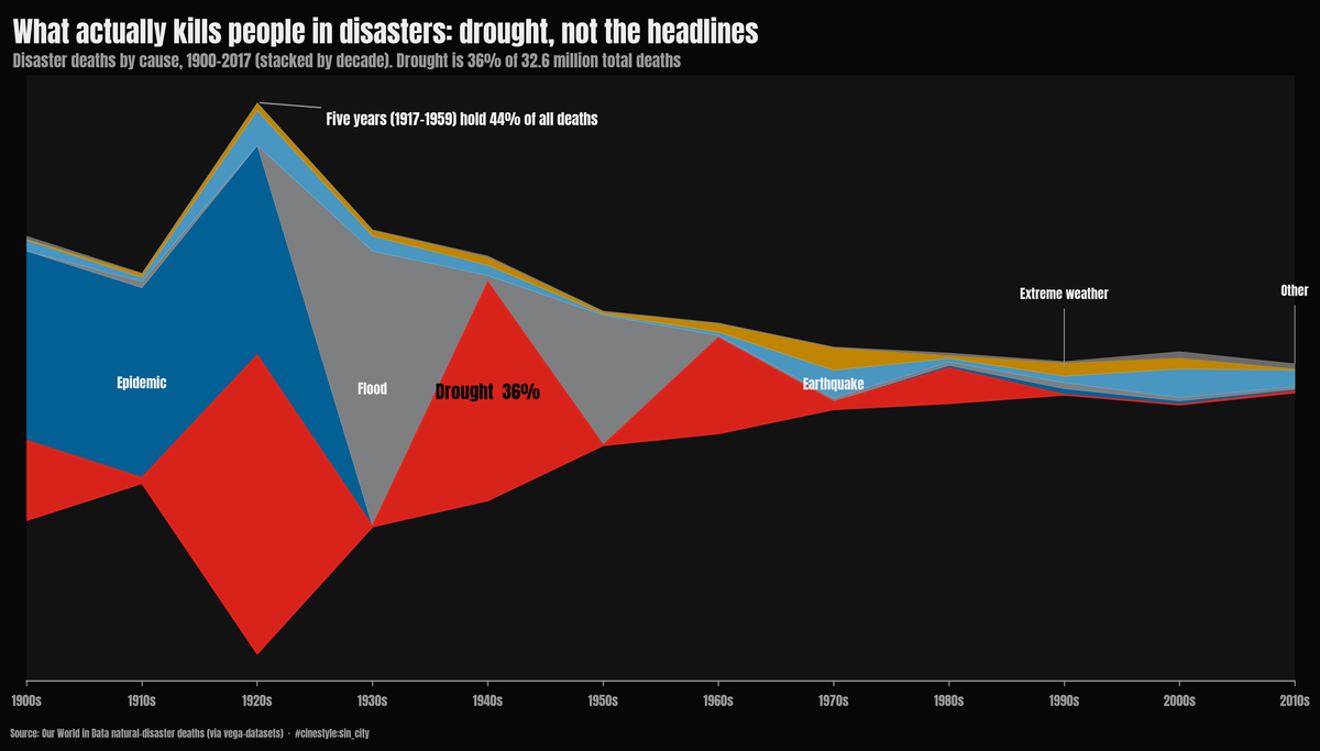
Natural-disaster mortality is a handful of catastrophes with quiet decades in between. Stack the deaths by cause across the decades and the shape says it before any number does: a fat early bulge of epidemics, floods, and drought that thins to almost nothing by the end of the century. Drought is the red river running through it, 36% of every disaster death since 1900, and the whole left side is a few years doing the killing.
Five calendar years out of 117 account for 44.3% of all the natural-disaster deaths in this record. Stretch it to ten years and you reach 68.6%. The other 107 years, almost the entire record, split the remaining third. Picture a century of mortality as a flat field with five towers on it. That shape is why no single headline about whether disasters are getting deadlier can be trusted.
What the data is
The source is the Our World in Data natural-disaster death series, pulled here through vega-datasets. It is 803 rows: a Year, a Deaths count, and an Entity that is either a disaster type (Drought, Flood, Earthquake, Epidemic, and six others) or a row labeled “All natural disasters” that totals them up.
The first step was to throw out the “All” rows and sum the ten types directly. Mixing a pre-computed total with its own components is how you double-count everything. As a check, the per-year typed sum never differs from the bundled total by more than 12 deaths across the overlapping years, so the components are clean. The record runs 1900 to 2017, with 117 distinct years carrying data. When a total and its parts are both in the file, sum the parts yourself.
What actually kills people
Summed over the whole record, 32.6 million people died. Drought leads at 11.7 million, 36.0% of the total. Epidemics follow at 9.6 million (29.4%) and floods at 7.0 million (21.3%). Those three are 87% of all the deaths. Earthquakes, which dominate the news, come fourth at 2.6 million, under 8%, and extreme weather fifth at 1.4 million, 4.3%. Everything below that, meaning extreme temperature, volcanic activity, landslides, dry mass movements, and wildfires, combines for about 1.1%.
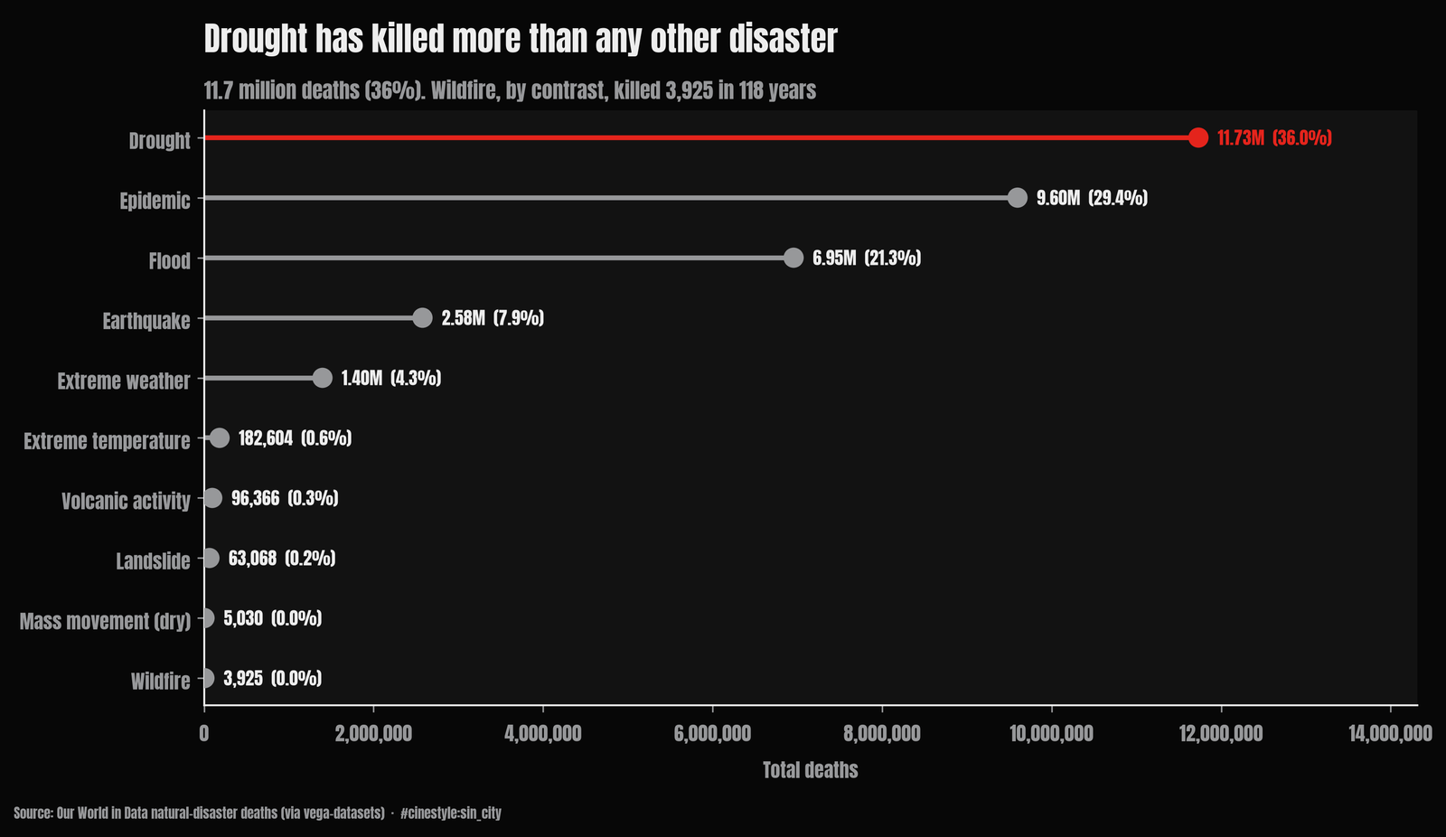
Wildfire killed 3,925 people across the entire span in this data. That is the gap between what kills people in bulk and what photographs well.
The distribution does not have a center
The mean annual death toll is 278,694. The median is 29,893. The mean is 9.3 times the median, and the skewness of the annual series is 3.29. A normal distribution sits near zero skew. A value of 3.29 is what you get when a few enormous years drag the average somewhere the typical year never visits.
Think of the “average” year as a place on the map that no actual year occupies. In a normal year, roughly 30,000 people die in natural disasters worldwide. The average of 280,000 is an artifact of averaging over catastrophes, not a year anyone lived through.
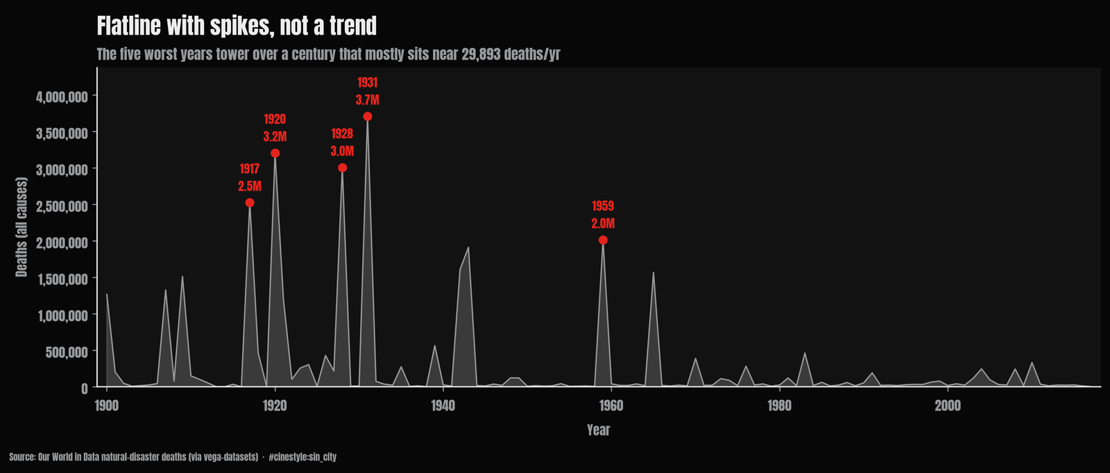
The catastrophes cluster. The single worst year, 1931, recorded 3.7 million deaths, 11.4% of the entire century-plus in one year, driven by the Yangtze and Huai River floods in China. The other four years in the top five: 1920 at 3.2 million and 1917 at 2.5 million, both with epidemics as the largest single driver at about 2.5 million deaths apiece; 1928, a 3.0-million drought year; and 1959, another flood year at 2.0 million. Plot the annual totals and they read as flatline with spikes. Most years barely register against 1931.
Is it getting better or worse
I fit an ordinary least-squares line of annual deaths against year. The full-record slope is -5,632 deaths per year, declining, and it clears significance (p = 0.0018). Fewer people are dying in disasters over time.
A single regression on data this skewed is not worth believing, so I pulled the five worst years and refit. The slope drops to -2,715 per year, still declining, still significant (p = 0.007), but roughly half the magnitude. Half of the apparent improvement over the century is just the absence, in recent decades, of another 1931.
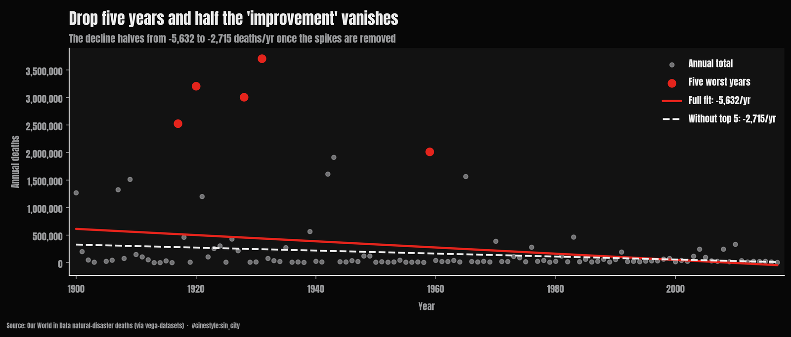
I expected excluding the outliers to turn the decline into a rise. Both fits still point down; what changes is the size of the decline. With the spikes in, you point at a steep line and say disasters kill far fewer people than they used to. Take the spikes out and about half of that slope goes with them. The r-squared of the full fit is a feeble 0.082, meaning year explains about 8% of the variance; the rest is year-to-year noise dominated by the spikes. Without the five worst years the r-squared falls to 0.064, so year still explains little. The trend is real, but it rides on the back of a few mega-events not recurring. One bad flood year and 2018 could have outweighed the previous twenty combined.
What I do not trust
One caveat does not engineer away: the death counts for old events are softer than the recent ones. A 1917 epidemic toll is a reconstruction, not a tally, and attribution and reporting have improved enormously over the century. Some of the apparent decline is better disaster response. Some is the simple fact that we count differently now than we did when these numbers were estimated decades after the fact. The five years that carry 44% of the deaths all fall between 1917 and 1959, the fuzzier early part of the record.
That leaves me skeptical of any clean line through this data. The slope is -5,632 or -2,715 depending on whether 1931 stays, fit to numbers that are part census and part guess. Disaster mortality is lumpy on a scale most charts flatten away, and a single flood year, 1931, can carry 11.4% of a 117-year record. The question worth asking is how big the next spike will be.