// article
The Dollar's Gravity
The dollar's gravity: which currencies track it, and which float free
The US dollar is the thing other money is measured against. Out of 22 currencies in this record, running daily from 1971 to 2026, exactly one holds its value against the dollar to within a percent or two a year. The other 21 move. Fifteen of them ended clearly weaker against the dollar, the euro ended almost flat, and five ended stronger. I went in expecting a handful of pegs and a handful of floats. What the data shows is one true peg, a wide spectrum of managed drift, and a few currencies that fell off a cliff.
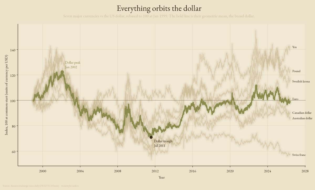
Each thin line above is one major currency, priced in how many units it takes to buy a dollar, rebased so they all start at 100. The bold line is their average, a homemade broad dollar index. When it rises the dollar is winning against the whole group at once.
The data is the datasets/exchange-rates daily series on a FRED H.10 basis: 260,563 observations across 22 currencies, every value quoted as foreign currency units per US dollar. A rising number always means the foreign currency lost ground to the dollar, so no quote directions needed fixing.
One real peg, and a lot of managed drift
A peg is simple to define and harder to find. If a currency is genuinely tied to the dollar, its day-to-day wobble against the dollar should be close to zero. So I measured the annualized volatility of each currency against the dollar over the recent stable window, 2021 onward. I used the recent window on purpose. Full-history volatility mixes regimes: China hard-pegged the yuan until 2005, then let it crawl, and averaging across both eras hides what the yuan does now.
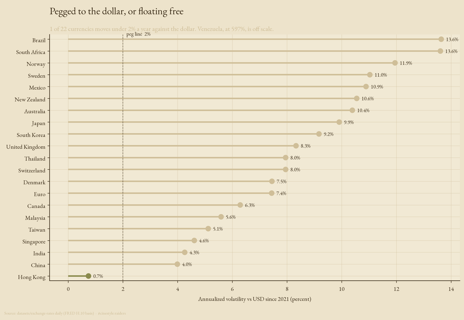
One currency clears the bar. The Hong Kong dollar moves 0.7% a year against the dollar, more than five times below the next currency, the yuan at 4.0%, because Hong Kong runs a formal currency board that holds it in a 7.75 to 7.85 band. That is what a real peg looks like in the data: a flat line where everyone else has texture.
Below it, a tier that looks pegged but is not. The yuan at 4.0% and the Indian rupee at 4.3% are managed, not fixed. The authorities lean against the move, so the volatility is low, but the level drifts where policy wants it. Singapore, Taiwan, and Malaysia sit just above them, between 4.6% and 5.6%. Then the open floats, from Canada at 6.3% to Brazil at 13.6%, taking whatever the market gives them. Venezuela is off this scale entirely at 596.8%.
The recent window matters. Over the full record the yuan’s volatility is 8.0% and Hong Kong’s is 3.2%; since 2021 they are 4.0% and 0.7%. A peg is a promise and a managed float is a preference, and the standard deviation tells them apart.
The dollar outran almost everyone
Volatility is the short-run story. The long-run story is direction, and the direction is brutal. Take each currency from its first observation to its last and the move against the dollar is usually down: 16 of 22 weakened, one was flat, and five strengthened.
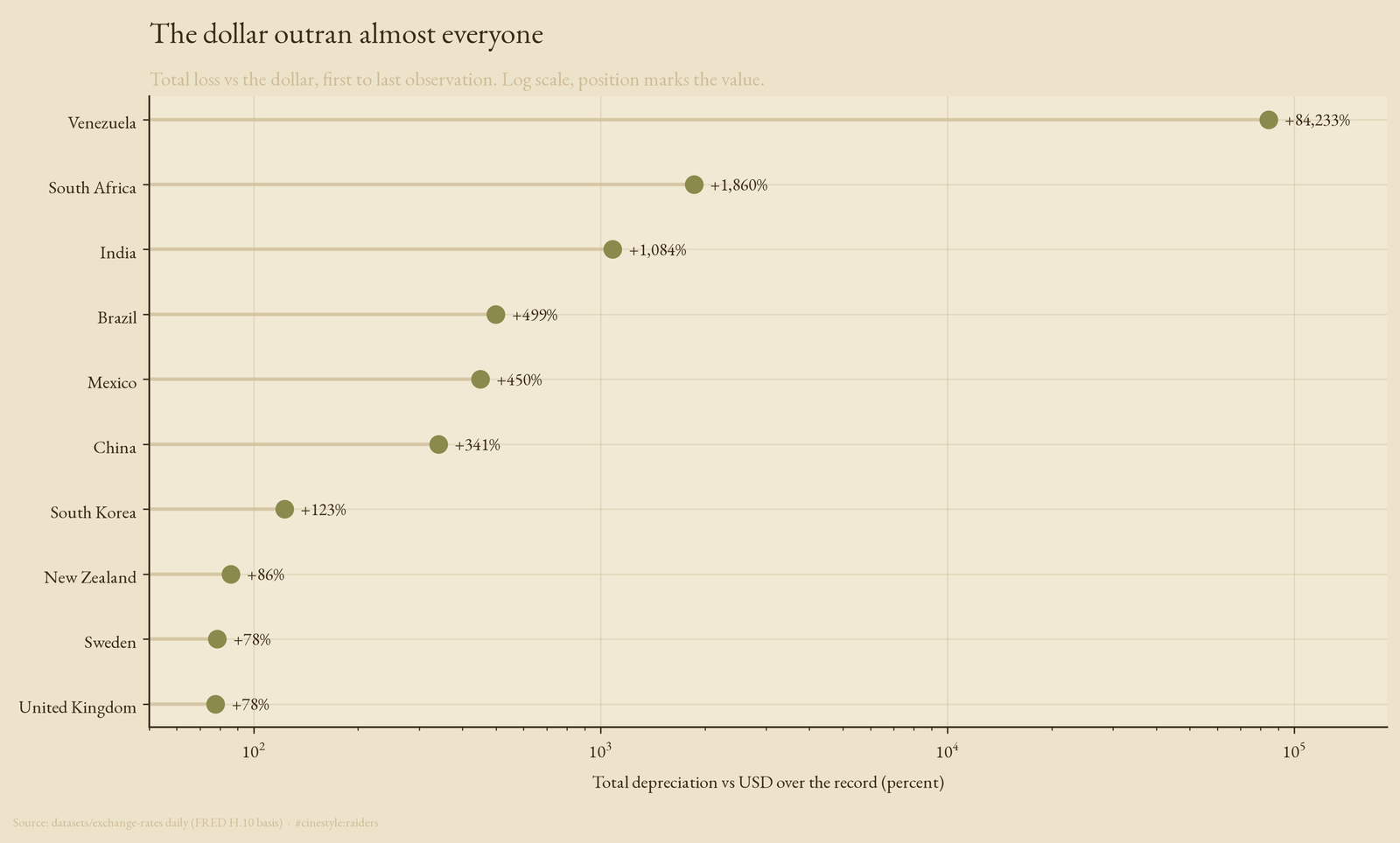
A dollar bought 84,233% more bolivars at the end of the record than at the start, which is the arithmetic of hyperinflation, not exchange rates in any ordinary sense. Put the other way, the bolivar lost 99.9% of its dollar value. The series runs only from 0.6498 to 547.9982 bolivars per dollar since 2000, far too little for Venezuela’s real inflation, so the source is almost certainly in redenominated units; treat the bolivar’s number as a floor. A dollar also bought 1,860% more rand (the rand lost 94.9% of its dollar value) and 1,084% more rupees (91.6%). Even the yuan, the currency people call manipulated to stay weak, costs 341% more per dollar, a 77.3% loss of value. The axis is logarithmic, because a linear one would crush everything below Venezuela into a single tick. Position marks the value, not bar length, because on a log scale a bar length means nothing.
Five currencies gained on the dollar over their full records: the Danish krone, the Taiwan dollar, the Singapore dollar, the yen, and, furthest, the Swiss franc. One franc bought 5.5 times as many dollars at the end as at the start (the rate fell from 4.32 to 0.78 francs per dollar). The yen bought 2.2 times as many. Strength against the dollar is possible, but it belongs to a short list of surplus economies and safe havens.
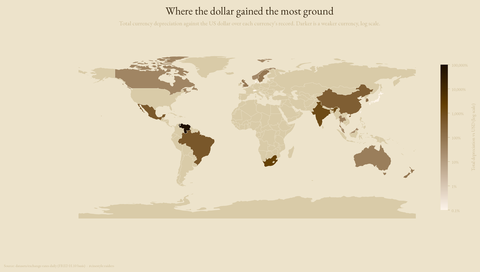
The map is the same ranking laid on geography. Two of the 22 currencies do not appear, Hong Kong and Singapore, because they are city-states too small to land on a country polygon at this map resolution. The euro is excluded too, since it spans many countries and maps to no single one. The five currencies that gained sit at the floor of the color scale, so the map shows weakness, not strength.
The dollar’s tide comes in and goes out
The broad index in the flagship is not a flat climb. It has a peak and a trough, and they are dated. Built from the seven freely floating majors that share a 1999 start, rebased to 100, the index topped out at 122.3 in January 2002, fell to 70.9 by July 2011, and sat at 98.5 at the end of the record. That is the dollar’s tide. It came in hard through the early 2000s, washed out for most of a decade as cheap money and the financial crisis did their work, and clawed most of the way back by 2026.
The episodes line up with the macro history without my having to assert it. The 2002 peak is the late dot-com strong-dollar era. The 2011 trough is the bottom of the zero-rate, quantitative-easing years, when holding dollars paid nothing and everyone reached for yield elsewhere. The index does not know any of that. It just averages seven exchange rates, and the macro story falls out of the average.
What this record cannot tell you
This is 22 currencies, not the world. The set skews toward developed and large-emerging economies, so the depreciation numbers understate the global picture, since the worst currency collapses tend to happen in countries not in this sample. The depreciation figures also span different windows: each currency runs from its own first observation, so a 1971 starter and a 1999 starter are not measured over the same decades. I report each one’s own window rather than forcing a common 2000 start, set by the bolivar, that would cut every 1971 series to its last 26 years.
The broad index is mine, equal-weighted across seven majors by geometric mean, not the trade-weighted DXY. It will not match the published dollar index tick for tick. It is built to show the shape of dollar strength over time, and the shape is right even if the weights are not the Fed’s.
I started this expecting a clean split between pegs and floats. The data has one peg, a gradient of managed currencies pretending to be pegs, a long ranking of slow defeats against the dollar, and five exceptions. The dollar tracks nothing; nearly everything else tracks it.