// article
Gas Prices and Driving
Gas prices and American driving look unrelated, until a price spike hits
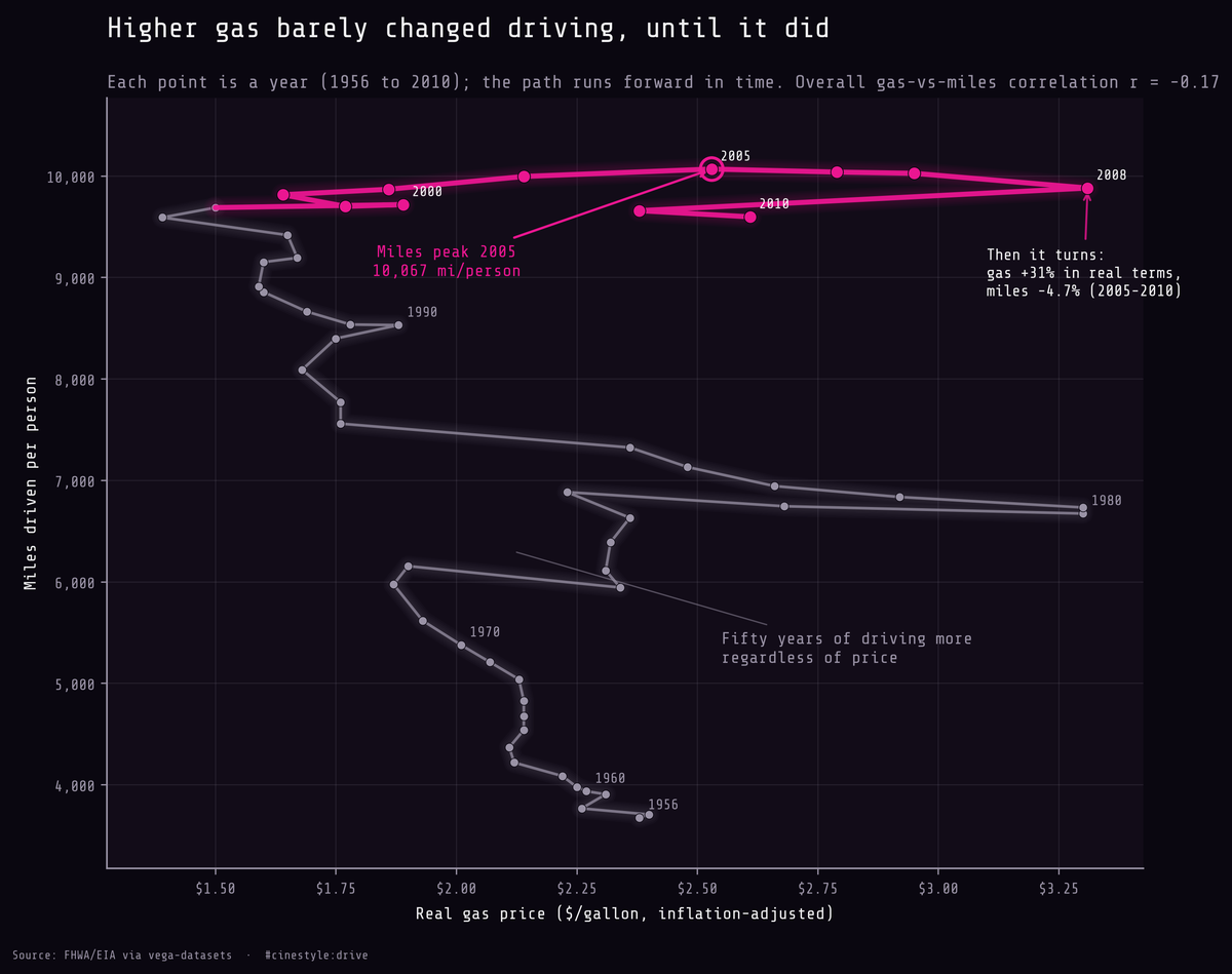
For fifty years, Americans drove more almost every year, whatever gas cost. Plot gas price against miles driven and let time draw the line. The path goes almost straight up: price swings moved it left and right but did not stop the climb. The exceptions come at the price spikes. Miles dipped after the 1974 oil shock and again around 1980, when real gas reached $3.30. Then, at the very top, the path hooks, as it did in smaller ways after those earlier spikes. Miles peak in 2005, gas keeps climbing in real terms, and the line curls back down. The rest of this post is me deciding how much of that hook I believe.
Run the correlation across the whole series and you get -0.174. That is the number I started with, and it is almost nothing. Over 55 years of US data, the price of gas and how far the average American drove are basically uncorrelated (p = 0.20, so I cannot even rule out zero). The full-span slope is -822.2 miles per dollar. If you walked in expecting “gas goes up, driving goes down,” the full-span number says you are wrong. It also hides two opposing trends.
The data is a small table from the FHWA and EIA, distributed through vega-datasets: one row per year from 1956 to 2010, with per-capita miles driven and the inflation-adjusted price of a gallon of gas. Fifty-five rows. You can hold the entire series in your head at once, which is rare and a little dangerous, because a single summary statistic over a span this short reads as authoritative when it has no right to.
That -0.174 hides a trend. Over the full span, miles driven per person went from 3,675 to 9,596, a 161% rise. People drove more and more, decade after decade, while gas swung between a low of $1.39 and a high of $3.31. Miles trended up through most of those swings, so a naive correlation mostly measures that secular climb against price noise and comes out near zero.
Split the eras and the sign flips
So I split the series. Gas spiked in the 1970s, fell for almost two decades, then climbed again after 2000. I put the cut at 2000, where that last sustained real-price climb begins.
The first era ran 1956 to 1999, 44 years. It was not uniformly cheap: real gas in this era ranged from $1.39 to $3.30, and the top of that range, in 1980 and 1981, sits one cent below the 2008 high. Within the era, regressing miles on gas gives a slope of -2,082.6 miles per dollar, with r = -0.475 (p = 0.001). The slope is negative and significant, but it is not a price response. Gas drifted down in real terms from the early 1980s to the late 1990s while miles marched up: two trends crossing. The negative slope is mostly secular growth meeting a falling price. It is a descriptive within-era fit, not a price-elasticity estimate, and it tells me little about how drivers respond to the pump.
The price-spike era ran 2000 to 2010, 11 years. Here gas climbs from a low of $1.64 to a real high of $3.31. And the within-era slope comes out positive: +109.4 miles per dollar, r = 0.354, p = 0.29. The fit is not significant, and it shows driving rising while gas doubled. That is the regime change the overall number erased, but the positive sign is its own trap.
Why the spike-era slope is positive, and why it is still the bend
For the first half of that decade, gas and miles rose together. Gas was recovering off a 1998 low while the economy ran hot and people kept driving more. Both lines went up. A regression does not know which way causation points; it sees two rising series and reports a positive slope. That is the first era’s trap, mirror-imaged.
The actual bend is at the end. Miles driven peaked in 2005 at 10,067 per capita, the highest value in the entire 55-year record. Then gas kept climbing. From 2005 to 2010 the real price went from $2.53 to its 2008 high of $3.31, up 30.8%, and miles fell 4.7%, from that 10,067 peak down to 9,596. Picture a driver who finally checks the per-mile cost and shortens the weekend trip. The curve rolled over when gas returned to the real price of 1980 and 1981. But 2008 is also when the financial crisis hit, so I cannot hand the whole drop to the pump.
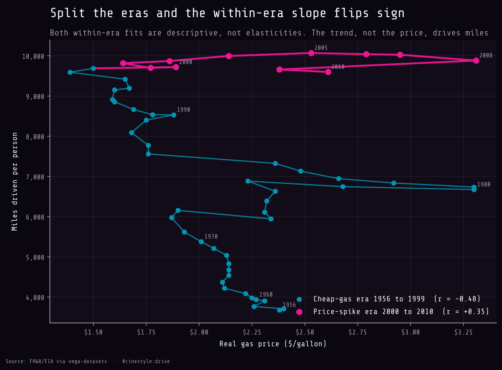
Color the same path by era and the two regressions are visibly fighting. The cyan path is the long first-era climb, sloping gently down-and-right (r = -0.48). The pink path at the top is the spike era, sloping up-and-right (r = +0.35). Two descriptive fits, opposite signs, and neither is a price elasticity. Both are mostly the secular trend crossing the price axis at different angles. The hook in the top-right corner is where miles fall while gas is high, though even there the six-point correlation is +0.34 (slope +208.5 miles per dollar), because gas fell back in 2009 while miles kept falling. The recession explains the hook at least as well as the pump does.
What is off about the chart, if I am honest, is how thin that hook is. The post-peak segment is six points. The spike era is eleven. I am reading a regime change off the last fifth of the data, and the spike-era correlation has a p-value of 0.29, which is to say not significant. The bend is real: it shows up cleanly in the raw miles series, peaking in 2005 and falling every year after through 2010. But calling the slope estimate precise would be overselling it. With n this small, one recession-shaped year moves everything.
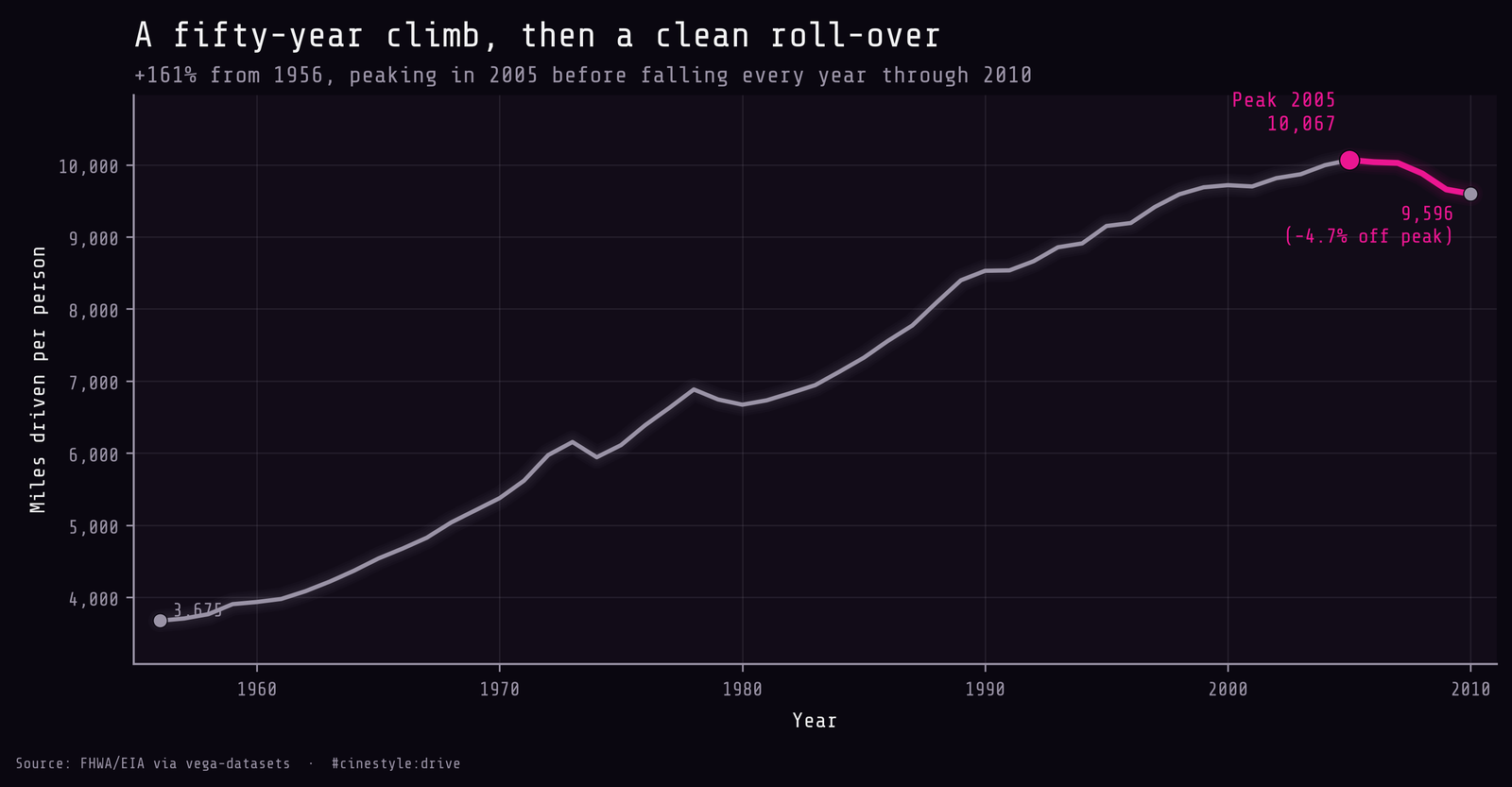
The miles-over-time plot makes the turning point hard to argue with, separate from any regression: a near-monotonic climb for fifty years, small dips in the mid-1970s and around 1980, a clean peak at 2005, then a downhill run.
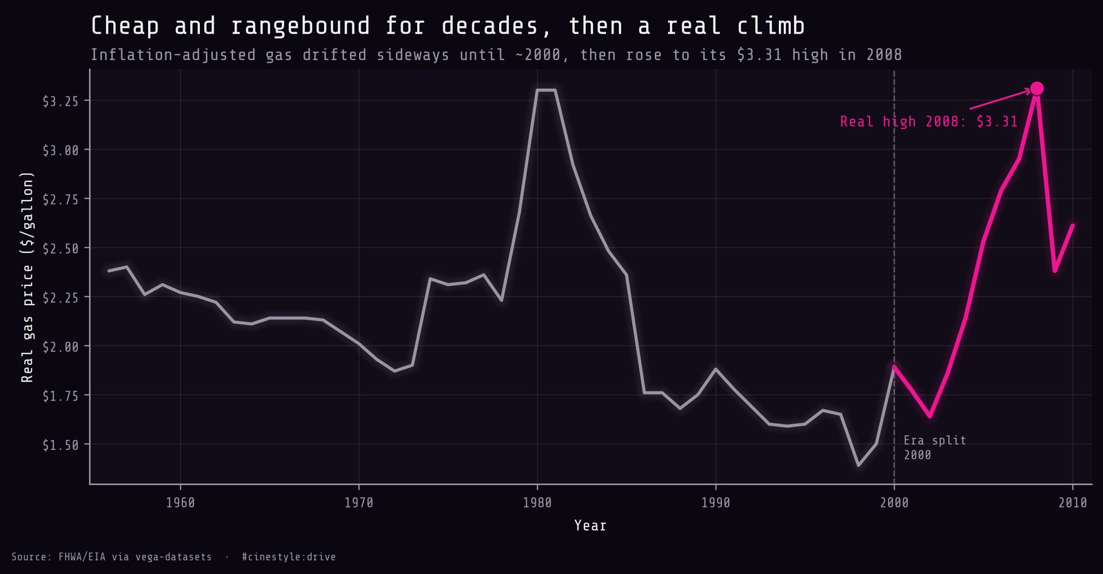
The price series shows why I cut the eras where I did: a spike to $3.30 in 1980 and 1981, a long slide to $1.39 in 1998, then a climb after 2000 to a 2008 high of $3.31.
Here are the limits. This is 55 annual observations of a national aggregate, gas is already inflation-adjusted, and correlation is not cause. Income, population, vehicle fleet efficiency, and a recession that landed right at the end all push on miles too, and I have controlled for none of them. The 2008 spike and the 2008 financial crisis arrive together, so I cannot cleanly separate “gas got expensive” from “people lost jobs and stopped commuting.” The 1970s and 1980 dips carry the same problem, since both oil shocks came with recessions. What I can say is narrow and, I think, solid: a single correlation over the whole span reads as roughly zero, and that zero averages a decades-long climb with bends at every major price spike.