// article
Price Versus Earnings
Does the stock market actually follow earnings?
Over the long run the stock market is a claim on corporate profits, and the price of that claim tracks the profits. Take Robert Shiller’s monthly S&P 500 record back to 1871, strip out inflation, and the answer is plain: across 151 years, real earnings grew about 19 times over and real price grew about 38 times. The market followed earnings, with long detours along the way.
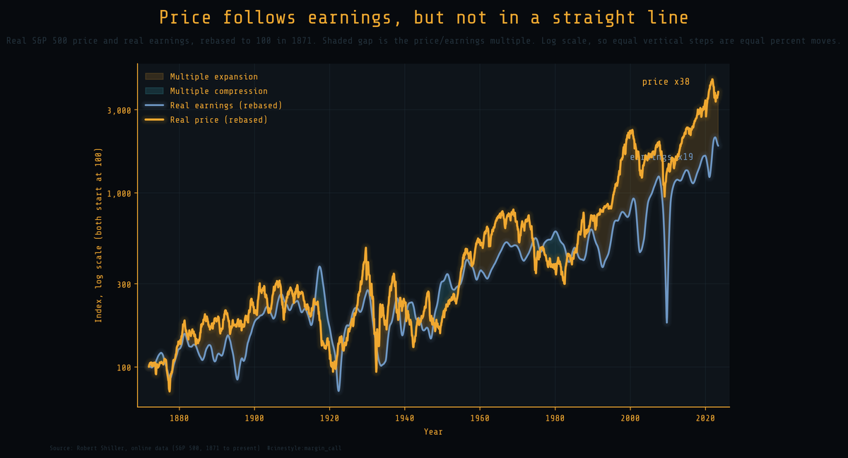
The two lines move together because they have to. The amber line is real price, the blue line is real earnings, and both start at 100 on a log axis, so a given vertical distance is the same percent move anywhere on the chart. The shaded band between the lines is the price/earnings multiple, and it is the whole tension of the article: every time price pulls away from earnings, the gap is the market paying more for the same dollar of profit. Earnings set the level, and the gap between the lines has never stayed open for good.
The recipe, built from raw columns
I built everything from the raw price, earnings, and consumer price index columns, not from the prebuilt real-price or PE10 fields, so every step is visible. The data is the datasets/s-and-p-500 copy of Shiller’s file on GitHub, accessed June 2026. Deflate nominal price to the latest month’s dollars with the price index. Do the same to earnings. The multiple is real price over a trailing twelve-month average of real earnings, smoothed over a year so one reported quarter cannot whip the ratio around.
The feed has a lag problem. It carries price forward every month but enters earnings and the price index late, so the most recent rows have no fundamentals. The multiple needs all three inputs, so my series stops in June 2023, the last month with real earnings and a real index. I left the missing quarters missing rather than fill them. The market is higher now than it was then.
The level correlation between log real price and log real earnings is 0.93. Over the long run, price and earnings stay tightly tied.
The decomposition: earnings did the work
If price equals earnings times a multiple, then in logs the growth splits cleanly. Real price growth is real earnings growth plus the change in the multiple, exactly, with no residual.
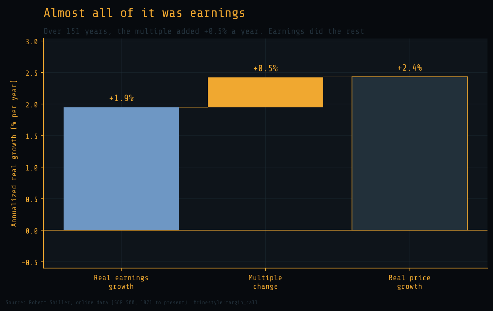
Real price compounded at 2.4 percent a year above inflation. Of that, real earnings growth supplied 1.9 points and the multiple supplied 0.5. Put as shares of the total log gain, earnings account for 80 percent of the rise and the multiple for 20. The multiple did expand over the century and a half, from a starting point that was cheap to an end point that is not, and that drift is real money. But it is the minority partner. The bulk of what you earned holding stocks for 151 years, you earned because the companies underneath made more money.
That answers the headline question. Over a long enough horizon the market follows earnings, and the multiple is a tax or a subsidy on the timing, not the engine.
Where the multiple ran the show
Year to year, the story is messier. The correlation between annual changes in real price and annual changes in real earnings is only 0.10. Over a single year, price and earnings barely move together.
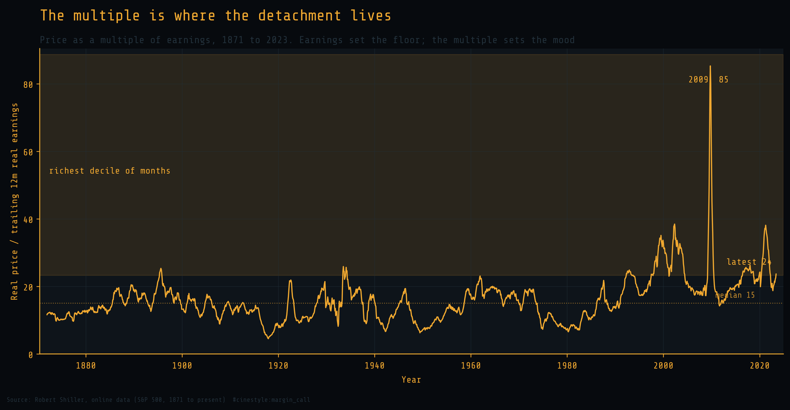
The multiple sits at a median near 15 across the whole record and spends most of its life in a fairly narrow band around it. The flat stretches in that band are when price and earnings move in lockstep. The detachments are when the band balloons. The top decile of the multiple starts at 23.3, and the latest reading of 23.7 sits inside it.
One spike on that chart is a measurement artifact. The 2009 reading near 85 is not the market suddenly paying eighty-five dollars for a dollar of earnings. It is the denominator collapsing: trailing earnings briefly went near zero in the financial crisis while price held, so the ratio exploded. A trailing twelve-month P/E always does this when profits crater, which is exactly why Shiller smooths earnings over ten years for his own measure. Read that spike as a story about earnings falling out of bed, not valuation soaring.
The detachment you can actually see
The widest the price line ever stood above where earnings alone would put it was April 2021. Rebased from 1871, price sat at an index of 4,139 while earnings sat at 1,260, more than three times higher. Put another way, about 30 percent of the index level rested on earnings growth and the rest on what investors were willing to pay for it.
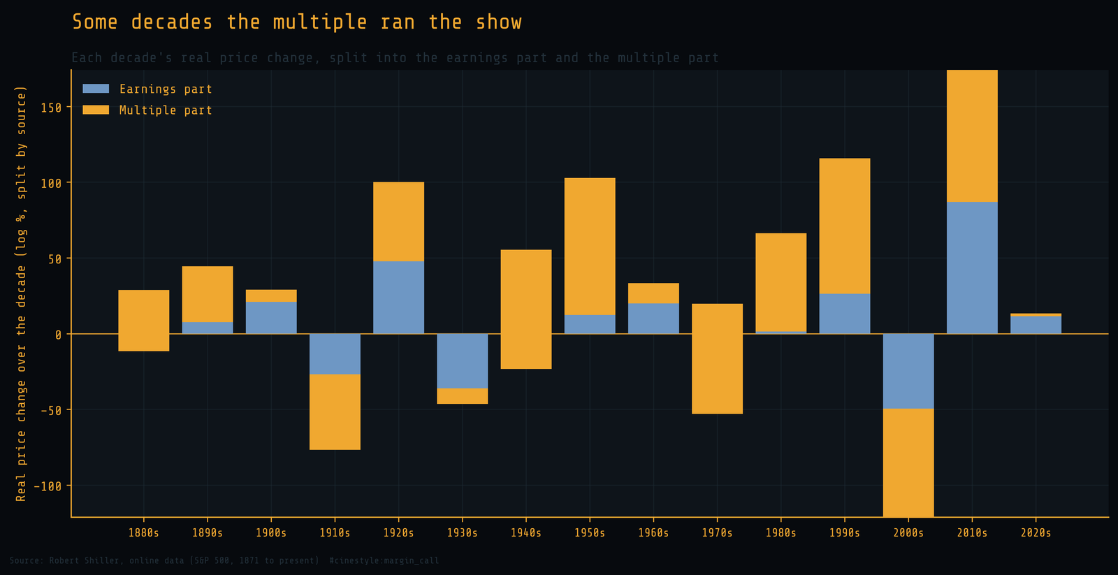
Sorting it by decade shows how often the multiple, not earnings, drove the move. The 1950s and 1980s and 1990s were multiple-led booms: earnings grew modestly while the market re-rated upward and paid the difference. The 2010s ran the other way, with earnings recovering off the crisis low while the multiple gave back what the 2009 collapse in earnings had inflated. The 2000s are the mirror image, and the same artifact: real earnings fell hard while the trailing multiple rose. The blue bars are the earnings part and the amber bars are the multiple part, and the visible total is the decade’s real price change. When the amber dwarfs the blue, you are looking at a decade the market told a story about the future and paid itself in advance.
So which is it
The market follows earnings over the long run and ignores them over the short. Both are true, and the timescale decides which one bites. If you hold for a generation, earnings growth is most of the return and the multiple supplied about a fifth of it. If you buy with the multiple above 23.3, where it sits today at 23.7, you are betting it stays there against a 151-year median of 15. Earnings anchor the price, and today the multiple sits in its top decile.