// article
Pulse Under Exertion
Thirty people, ninety pulses, and one mistake everyone makes
After thirty minutes of running, the average pulse in this dataset sits at 126 bpm. The people who had been resting that whole time read 91.4. That 34.6 bpm gap is the obvious headline, and it is real: Welch’s t = 6.15, p < 0.0001, Cohen’s d = 2.75. The harder part is counting how much data there actually is, because it is easy to lie to yourself about that.
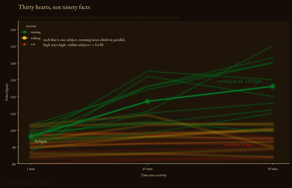
Each line above is one person, not one measurement. The running lines climb together and stay in their lanes; a person who starts high ends high, and that parallel structure is exactly what naive pooling throws away. The mean within-subject correlation is 0.638, which is another way of saying these are not ninety independent readings.
Here is the setup. The exercise dataset ships with seaborn (catalog source: via seaborn-data). It has 90 rows from only 30 people. Each one was measured three times, at 1 minute, 15 minutes, and 30 minutes into their activity, and each person did exactly one kind of activity: rest, walking, or running. So kind is between-subjects (different people in each group, 10 apiece), diet is between-subjects too (15 low fat, 15 no fat), and time is the within-subject repeated factor.
Load this, run a t-test on all 30 running rows against all 30 rest rows, and you get a p-value with a lot of zeros after the decimal. You also get a wrong answer, because those 30 “independent” running measurements are really 10 people counted three times each.
The trajectories
First, what happens over the thirty minutes.
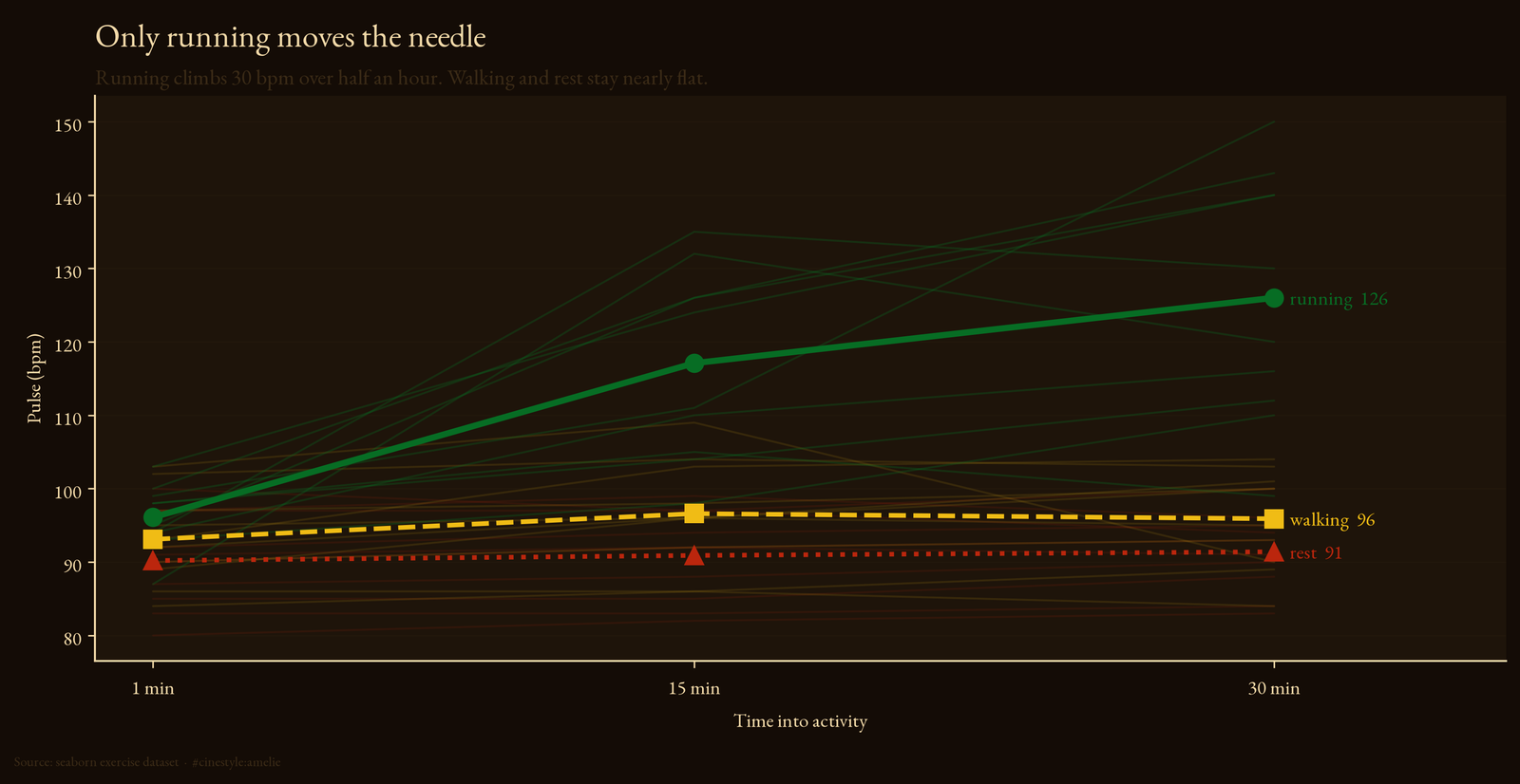
Running is the only group that does anything. It starts at 96.1 bpm at one minute and ends at 126.0, a rise of 29.9 bpm, a slope of about 1.03 bpm per minute. Walking barely moves: 93.1 to 95.9, and the 15-minute mean of 96.6 actually sits a hair above the 30-minute mean, so it is not even monotonic. Rest is a flat line pretending to be data: 90.2, 90.9, 91.4. A slope of 0.04 bpm per minute over thirty minutes is the pulse equivalent of standing still.
The faint running lines do not fan out from a common start. They run parallel. Running is the only group with a change large enough to test.
Why you cannot pretend you have 90 numbers
To put a number on it, I reshaped the data so each subject is one row with three columns, their 1-, 15-, and 30-minute pulses, and correlated the columns.
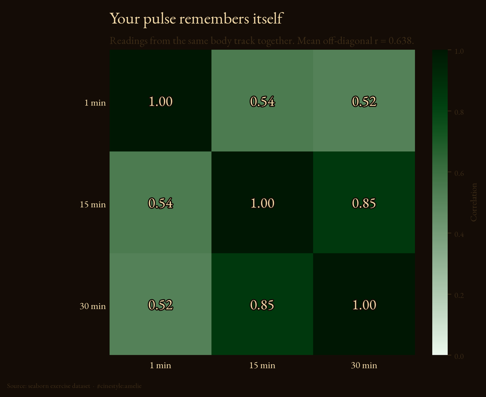
Your pulse at 1 minute correlates with your pulse at 30 minutes at r = 0.519. The 1 and 15 minute readings correlate at r = 0.545, and the 15 and 30 minute readings are tighter still at r = 0.85. The mean off-diagonal correlation is 0.638. These are three readings of the same person, so one reading predicts the next.
Those correlations are pooled across all 30 subjects, and that pooling flatters them. The ten runners sit high at every timepoint and the ten resters sit low, so part of each r is the activity groups separating, not a single person’s pulse persisting. The point stands either way: the three readings are not independent.
I also split the total variation in pulse into a between-subject piece and a within-subject piece. 63.6% of all the variation here is between subjects. Picture nearly two-thirds of the spread as fixed luggage each person carries into the room before the clock even starts. Because each person did only one activity, that share includes the running-versus-rest effect as well as each body’s baseline; the between-subject piece is computed from subject means, and a subject’s mean absorbs their activity. What it excludes is the clock. Treat each measurement as a fresh independent observation and you inflate your effective sample size by a factor of three, which quietly shrinks every standard error you compute. The p-values get smaller for a reason that has nothing to do with the effect being real.
So the honest comparison uses one slice at a time. The running-versus-rest test up top is the 30-minute readings only, 10 different people per group, genuinely independent. That is where the 34.6 bpm gap and d = 2.75 come from. The effect is large, the design is small, and both are true at once.
The diet detour
The dataset also tags each subject as low fat or no fat, so I checked whether diet moves the pulse. Across everyone at 30 minutes, low fat averages 98.8 and no fat 110.1, an 11.3 bpm difference that does not clear significance (p = 0.107, n = 15 per group). Call that null.
Then I got greedy and looked inside the running group, where a metabolic effect should show up loudest. And there it was: no-fat runners at 30 minutes averaged 140.6 bpm against the low-fat runners’ 111.4, a 29 bpm chasm, Welch’s t = -6.1, p = 0.0003.
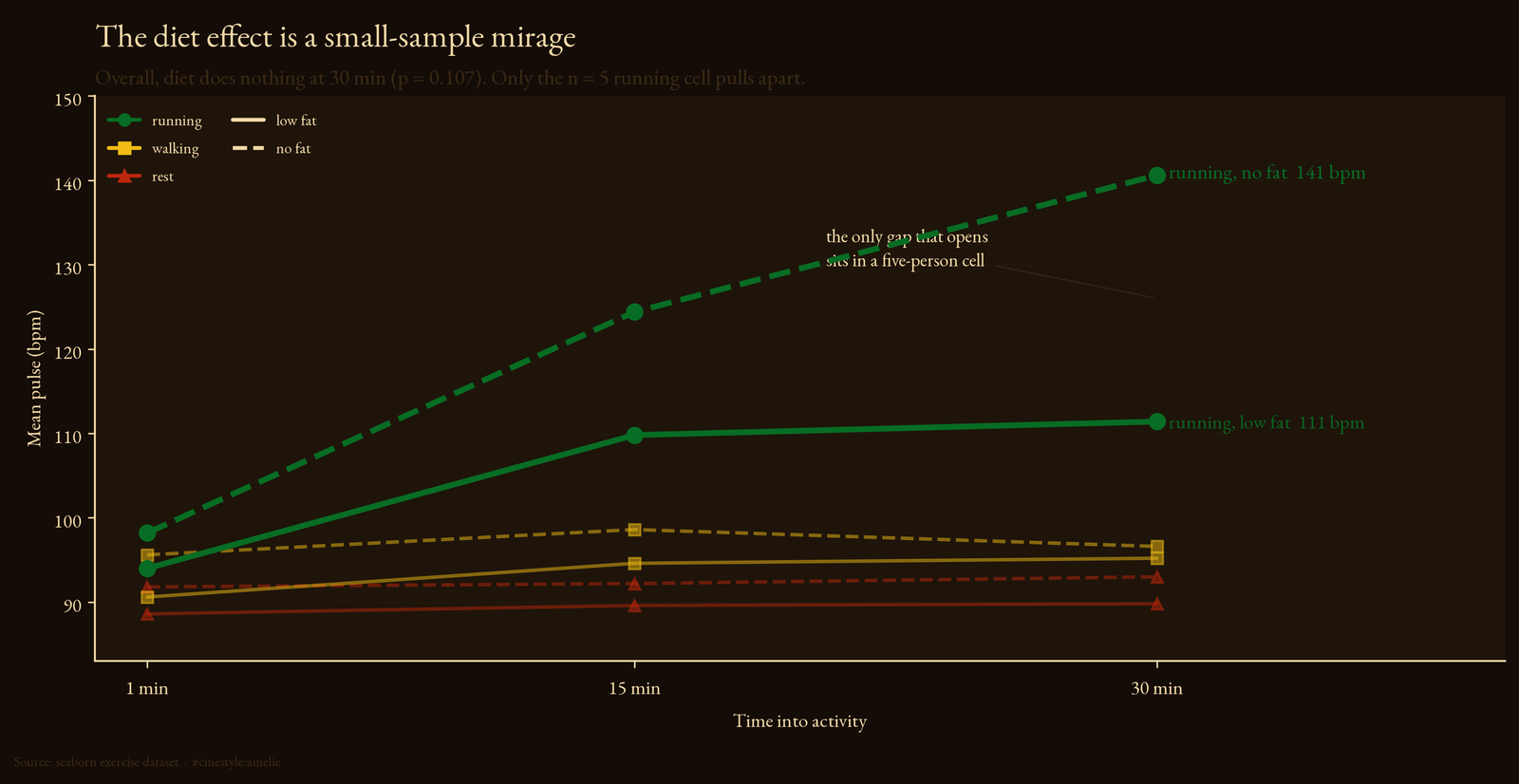
I do not believe it, because that cell holds five people. A t that large from five per cell says the two small groups barely overlap, not that diet caused it. With n = 5, one fit person assigned to the low-fat lane and one anxious one in the no-fat lane can manufacture a 29 bpm “diet effect” out of nothing but the luck of the draw. The overall diet test, with three times the sample, said nothing. When the big sample is quiet and a tiny subgroup is screaming, trust the quiet one.
What is left when you are honest
Strip out what the data cannot support and one clean claim remains. Running drives pulse up steeply and predictably; rest does not. And whatever the clock says, most of the pulse variation in this study sits between people, activity included. The 34.6 bpm running-rest gap survives every honest test I threw at it. The diet effect does not.
The whole experiment is 30 people, and that is the main caveat. Everything here is descriptive, and with 10 subjects per activity and 5 per diet cell, I would want an order of magnitude more bodies before writing any of it down as fact. The data hands you 90 rows and dares you to treat them as 90 facts. They are 30 people, measured while their hearts were still attached to who they already were.