// article
fMRI Response Curves
The average brain response is a curve, and averaging is what draws it
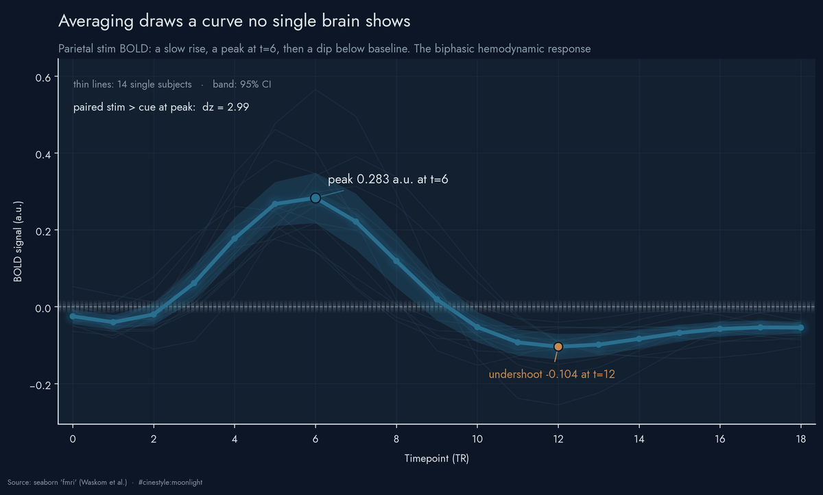
No single subject shows the smooth biphasic curve; the average across subjects produces it. Each thin line is one subject’s parietal stim trace, and not one of them traces that shape on its own. Average all fourteen at each timepoint and the hemodynamic response falls out: a rise, a peak of 0.283 a.u. at t=6, an undershoot to -0.104 by t=12. The peak holds up paired against cue at dz=2.99. Everything below is the case for why averaging, not any single measurement, is what you can trust.
Pull up one person’s trace and it is a mess of jitter that wanders above and below zero with no obvious shape. Stack 14 of them and average at each timepoint, and a curve falls out: a slow rise, a peak around six, then a dip below where it started. That curve is a hemodynamic response, present all along under noise that the mean cancels. I expected averaging to help, not to carry the whole result.
The data
This is seaborn’s fmri set, from Waskom et al. via seaborn-data. 1064 rows, 14 subjects, 19 timepoints (labeled 0 through 18, one per TR). Two event types, stim and cue, and two brain regions, parietal and frontal. The signal column is BOLD activity in arbitrary units, percent-change-like, centered roughly on zero. It is a packaged demo subset, so I am not going to pretend these are clinical effect sizes. The shape is real, and the shape is what I am reading.
The design is balanced, which makes the averaging argument honest. Every event-by-region-by-timepoint cell holds exactly 14 measurements, one per subject. No cell is propped up by a lucky subset.
Stim rises and falls; cue barely moves
Here are the four mean timecourses, with 95% confidence bands across subjects.
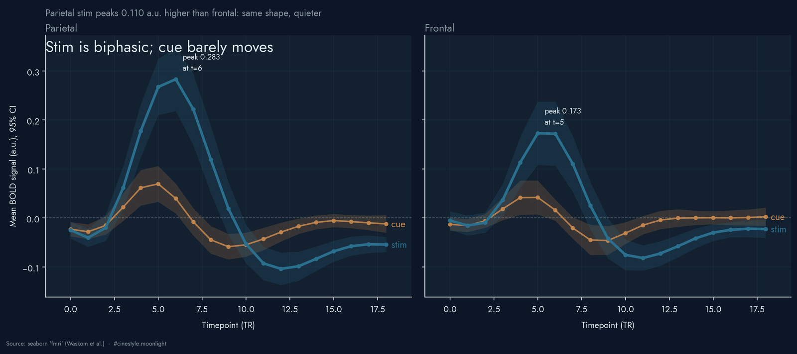
The parietal stim curve is the textbook hemodynamic response. It starts near baseline (the t=0 mean is -0.025), climbs to 0.283 at timepoint 6, then overshoots downward instead of settling back, bottoming out at -0.104 at timepoint 12 before recovering. That undershoot below its t=0 baseline of -0.025 is the biphasic part, and it bottoms out at -0.104 at timepoint 12. Real BOLD does this. The vasculature overcompensates after the burst of activity, and the signal dips before it returns.
Frontal stim does the same thing, smaller and a touch faster. It peaks at 0.173 at timepoint 5, one TR earlier, and troughs at -0.082 around timepoint 11. So the frontal curve has the parietal shape with a peak 0.110 units lower.
The cue curve stays nearly flat. At the parietal stim peak (t=6) the cue mean is 0.040 against a stim mean of 0.283. Whatever a cue does to these regions, it does not produce the big lagged swing that a stimulus does. The gap between them at that peak is 0.244 in parietal and 0.131 in frontal. A cue announces; a stimulus moves the blood.
Why averaging does the work
The honest version of the headline figure is this one.
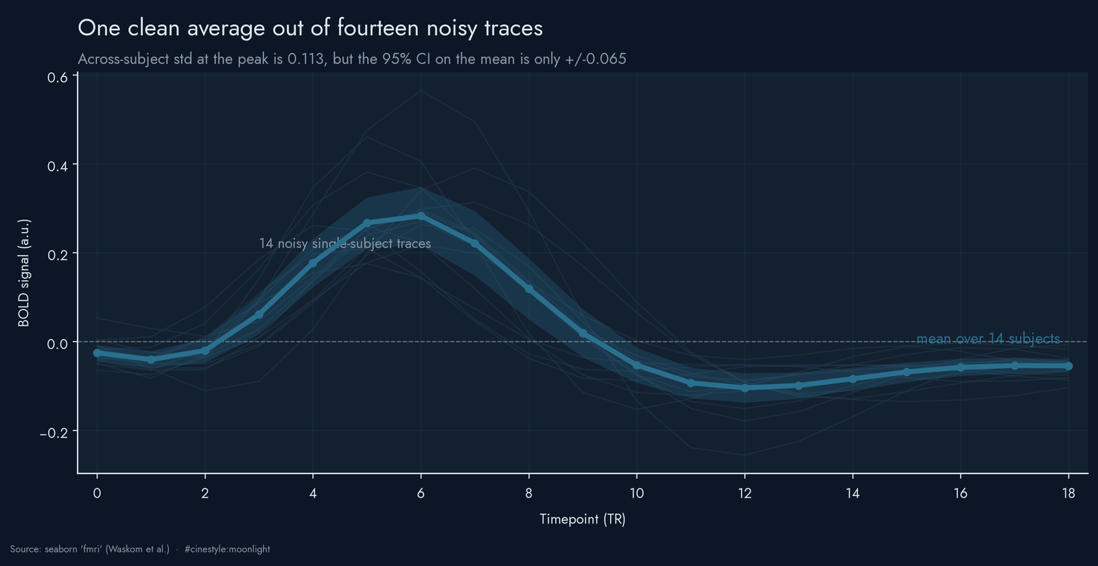
The faint lines are the 14 individual parietal stim traces. Look at any one of them and you would struggle to call the peak. They cross zero repeatedly, spike at different timepoints, and a couple of them are barely distinguishable from a random walk. The thick line is their mean, and it is the smooth biphasic curve from before. One subject’s trace is too noisy to locate the peak, but the mean of fourteen is clean enough to read it off the chart.
You can put a number on the spread. Think of each subject’s trace as the true curve plus a private gust of noise; averaging blows the gusts against each other until they cancel and the curve stands still. At the parietal peak, the across-subject standard deviation is 0.113 against a peak of 0.283. The standard error shrinks with the square root of the sample, so the 95% confidence interval on that peak mean is only about 0.065 wide on each side. The mean is pinned down even though no single subject is. Event-related designs collect many trials and subjects for this reason: the noise is roughly zero-mean and cancels in the average, while the response does not.
Is the stim-cue gap real, or am I reading tea leaves?
I tested it the paired way, since each subject gives both a stim and a cue measurement at the same timepoint. At the parietal peak (t=6), stim beats cue with a paired t of 11.19 across the 14 subjects, p around 4.8e-08, and a paired effect size (Cohen’s dz) of 2.99. That is enormous. Frontal is weaker but still decisive: t = 6.02, p around 4.3e-05, dz = 1.61.
The subject-level picture explains why the test is so confident.
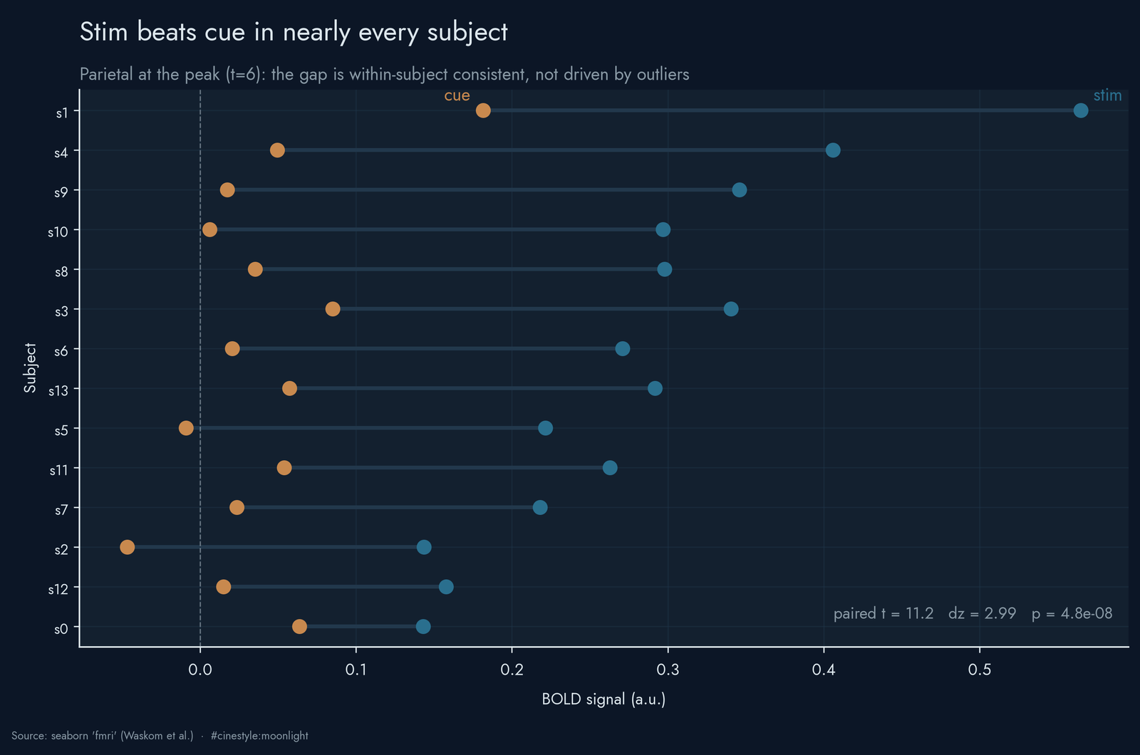
Each row is one subject, and the line connects their cue dot to their stim dot at timepoint 6. The stim point sits to the right in most subjects, which is what a dz of 2.99 requires: the mean paired difference is about three times its own standard deviation, so a few outliers cannot produce it. That within-subject consistency and it is the same consistency that lets the mean curve be trustworthy despite the noisy individual traces. A within-subject effect this aligned does not need a large sample to convince you.
The catch
I want to be clear about what this is not. The signal is in arbitrary units, so 0.283 does not mean 0.283% of anything I can defend. This is a teaching subset shipped with a plotting library, not a study I would cite for a number. The timepoints are integers with no stated TR length, so when I say the parietal peak lags the frontal one by a TR, I cannot convert that to seconds. The paired test also has a selection step: I picked t=6 as the timepoint where the stim mean peaks, then tested stim against cue at that same timepoint. That choice favors a large gap, so read the t of 11.19 as an upper-end view, not a pre-registered test. What survives all of that is the structure: a lagged, biphasic rise-and-undershoot for stimuli, a flat line for cues, the same in both regions with parietal louder, and an averaging effect strong enough that the group curve is clean while every contributor to it is noise.
The thing that made me re-run the code was the undershoot. I had half-expected the stim curve to peak and decay back to zero, the boring monophasic version. It goes negative instead and bottoms out at -0.104 at t=12. The figure shows that trough as the floor of a sustained dip, not a single rogue timepoint, the same physiological overshoot you would draw on a whiteboard if someone asked you to sketch a hemodynamic response from memory. The demo data has it baked in. Average enough noise and the biology shows up anyway.