// article
US Health Spending
The US spent $7,194 more per person than Japan and expected to live 7.7 fewer years
In 2020 the United States spent $11,859 per person on health care. Japan spent $4,666. For paying 2.54 times as much, the US got a life expectancy of 77.0 years. Japan got 84.7. The country that outspent everyone finished dead last among the six in the data, by a margin you can measure in years off the end of a life.
That number stopped me, so I went looking for the rule it broke.
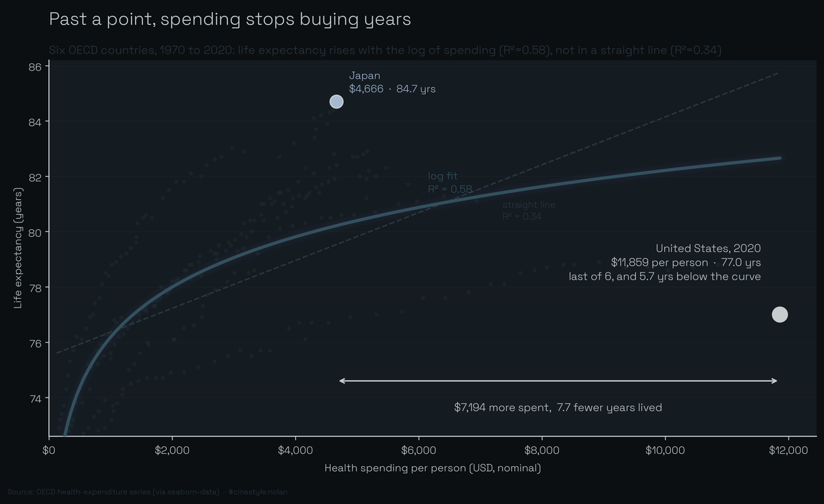
Spending buys years steeply at first, then the curve flattens, and the US has run so far out to the right that the curve has nothing left to give it. Japan, at less than half the spend, is the country sitting where the US should be.
The data is the OECD health-expenditure series that ships with seaborn (load("healthexp"), sourced as “OECD via seaborn-data”). It is small and clean: 274 rows, six countries (Canada, France, Germany, Great Britain, Japan, the USA) running 1970 to 2020. Four columns: year, country, spending per capita, and life expectancy. The spending column is the OECD’s per-capita health expenditure in US dollars at current prices and current purchasing power parities; Germany’s 1970 value of $252.3 is the OECD’s published figure in that unit. So the numbers are adjusted for price levels between countries but not for inflation over time. That is the whole world I get to reason about, and I will say up front it is a thin one. Six rich countries is not a law of nature.
The curve is real, and it bends
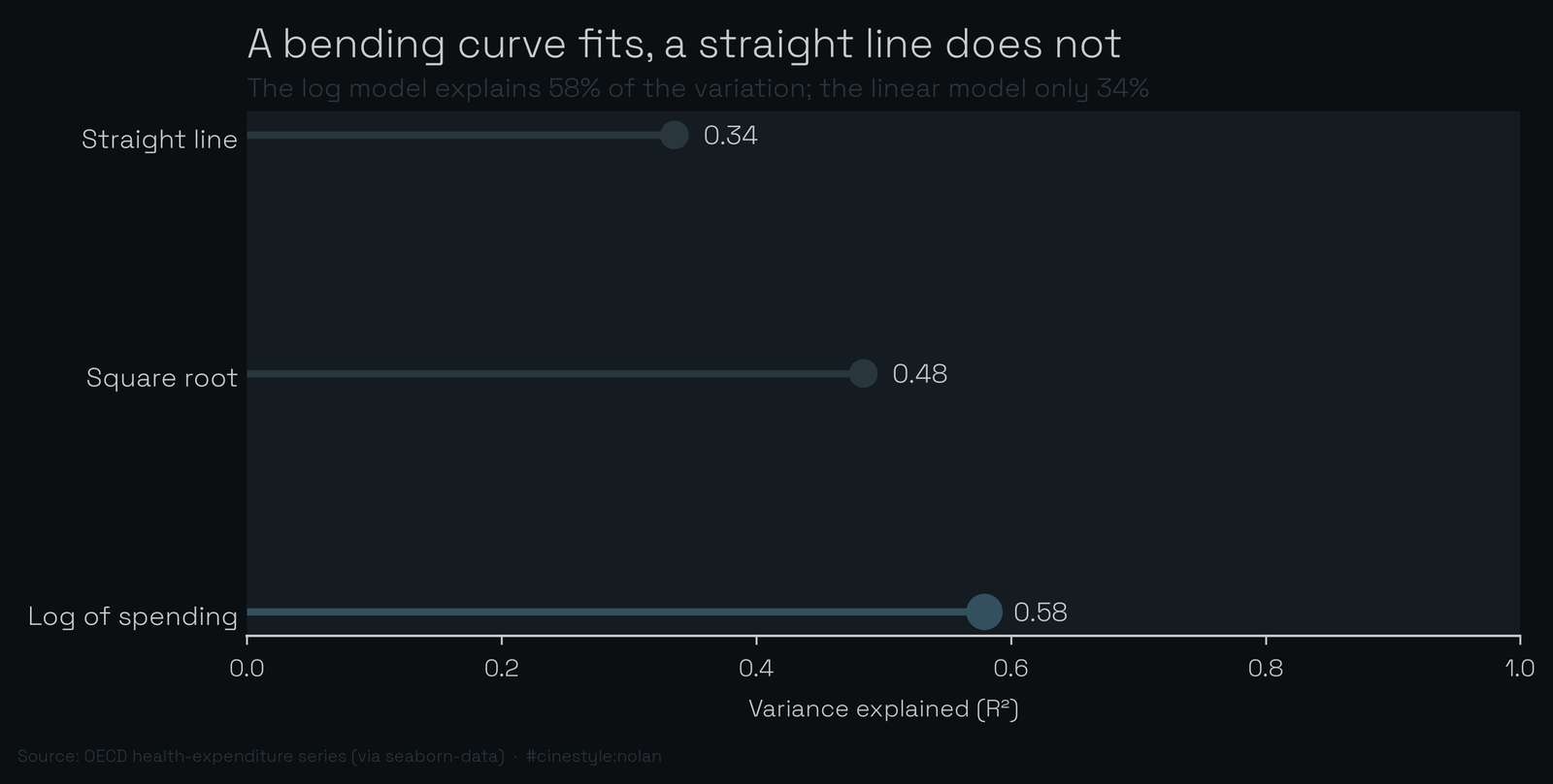
Pool every country-year and plot life expectancy against spending and the shape is obvious before you fit anything: it climbs fast and then flattens. A straight line through that cloud explains about a third of the variance, an R² of 0.34. Swap in a log curve, where life expectancy rises with the log of spending, and R² jumps to 0.58. A square-root fit lands in between at 0.48. The log fit wins because the returns diminish. Written out, it is life expectancy = 58.08 + 2.62 × ln(spending).
You can read the bend straight off that coefficient. Each doubling of spending buys 2.62 × ln 2, roughly 1.8 years of life expectancy. That is a doubling, not a fixed dollar amount, and that difference is what bends the curve. Go from $1,000 to $2,000 per capita and the curve predicts about 1.8 extra years. Go from $9,000 to $10,000, the same thousand dollars but added near the top, and it predicts about 0.28 years. That is about three months, roughly 15 percent of the payoff the same thousand dollars bought at the bottom.
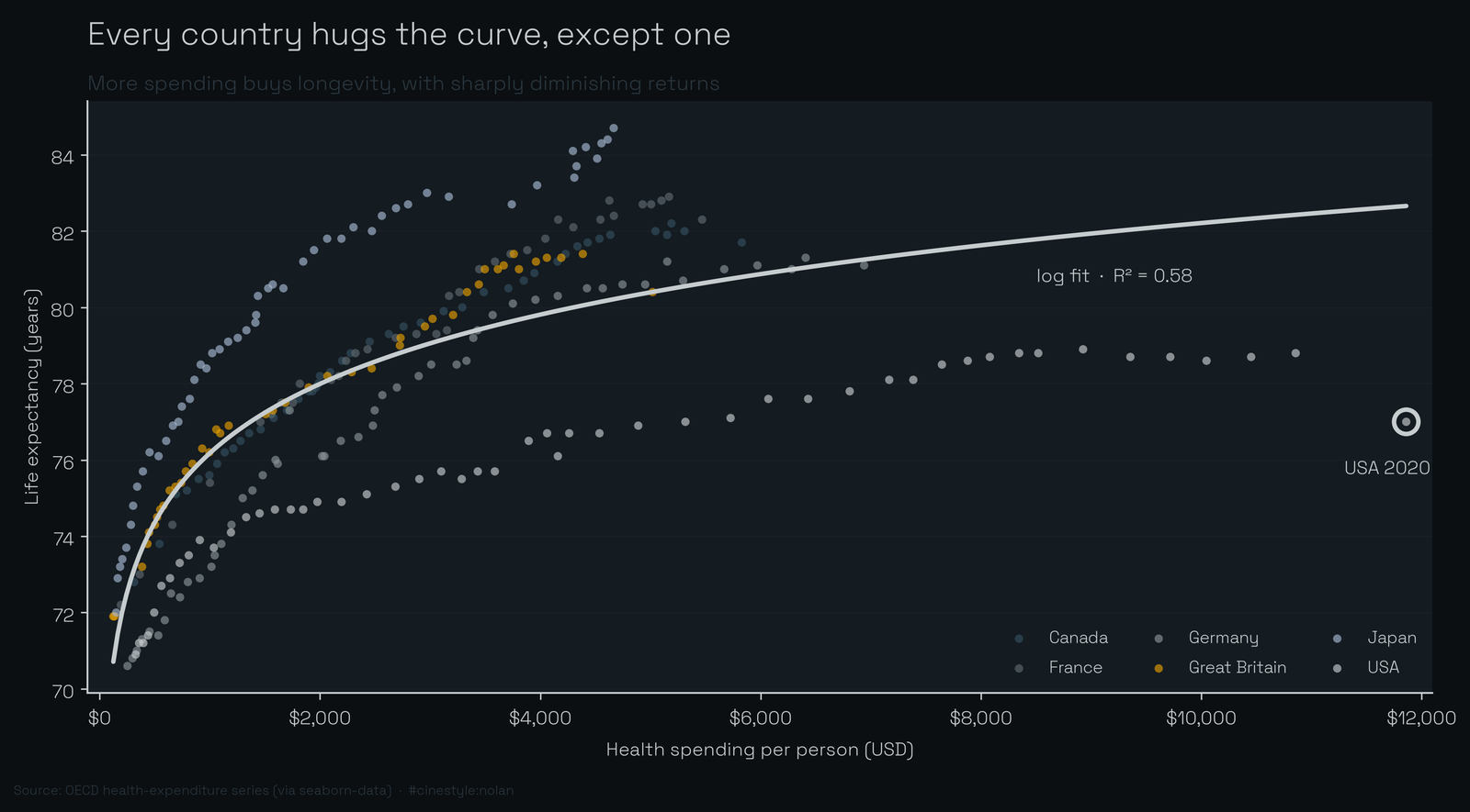
Color the cloud by country and the same shape holds. The fitted line sweeps up and levels off, the country tracks stack along it, and then there is the USA, circled, sitting far out to the right and well below the curve. At the US spending level the log fit predicts a life expectancy of 82.7 years. The US reached 77.0, so it sits 5.7 years below the curve while the other five sit near it.
The outlier, quantified
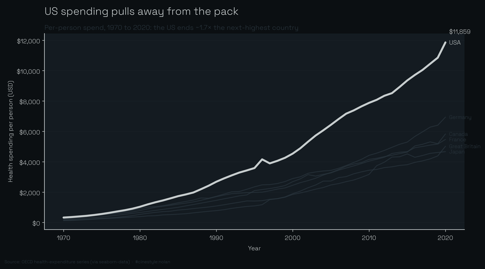
At 2020, the last year all six countries report, the US spent $11,859 per capita. The next-biggest spender was Germany at $6,939. That is a premium of $4,920: the US spent 71% more than the second-place country, and Germany is not a cheapskate. Against Japan, the cheapest of the six at $4,666, the US premium is $7,194.
For that money the US ranks sixth of six on life expectancy, 7.7 years behind Japan, the cheapest country in the set. If spending bought longevity in any straightforward way, those two facts could not sit in the same table.
A few limits come first. The spending here is in current dollars, so every multiple below includes fifty years of price growth, not only more care. The PPP conversion evens out price levels between countries, but it does not separate higher US prices for labor and drugs from more treatment. And life expectancy is multi-causal. Diet, guns, cars, opioids, obesity, and inequality all push on it, and none of them appear in these four columns. The chart can show that the US is an outlier. It cannot tell you the outlier is the health system’s fault. Keep those limits pinned to everything below.
Everyone bought more; almost no one bought much more life
The time series sharpens it. From 1970 to 2020 (1971 to 2020 for Canada, whose series starts a year late) every country in the set multiplied its per-capita spending many times over. Great Britain went up 40-fold. Japan 31. France 28. Germany 27. The US, 36-fold, from $327 to $11,859.
And the lifespan payoff for all that? Japan, spending the least, gained the most: 12.7 years. Germany gained 10.5, France 10.1, Canada 8.9, Britain 8.5. The US gained 6.1, the smallest gain in the group, off the largest spend.
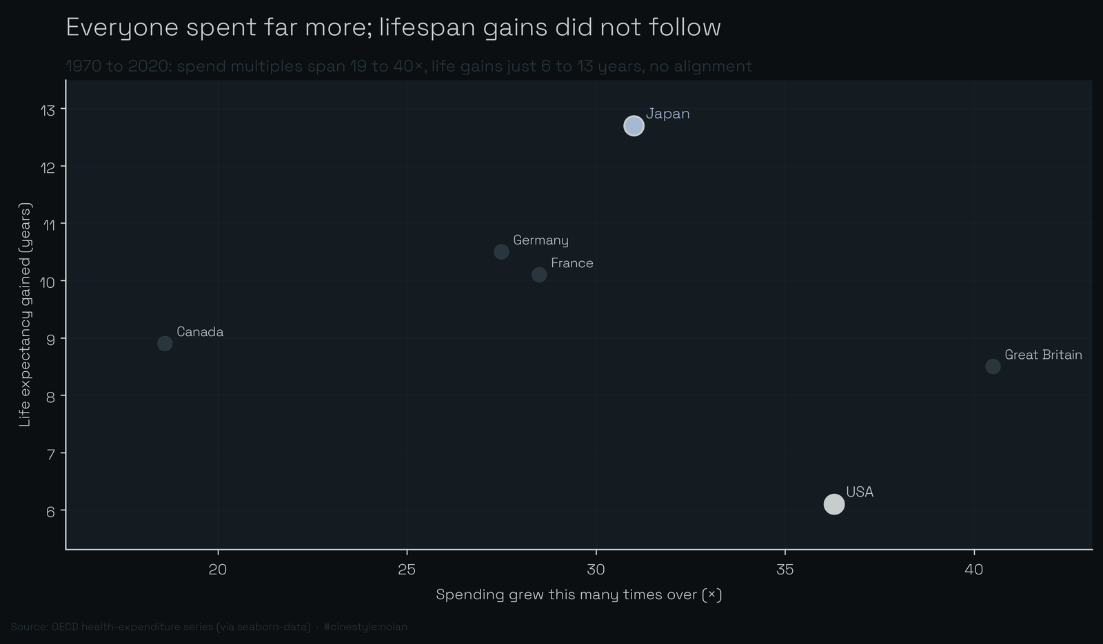
This last chart is the one I keep coming back to, because it is the one that surprised me. I expected the spending multiples to line up with the life-expectancy gains, spend more aggressively and gain more. They do not. The x-axis spans 18× to 40× and the y-axis spans 6 to 13 years, and the points are basically scattered. The country that grew its spending the hardest, Britain at 40x, gained 8.5 years. Japan grew spending the least and gained the most. That also means the pooled curve partly tracks fifty years of general progress, since every country gained 6.1 to 12.7 years while its spending grew 18.6x to 40.5x. Whatever drove a half-century of rising lifespan across these countries, the size of the checkbook was not it.
The fit comparison puts the straight line at 0.34 and the log curve at 0.58, so even the better model leaves 42 percent of the variance unexplained, and the US is a large part of it.
So the headline holds, with an asterisk. More health spending does buy longevity, steeply at first, then with brutally diminishing returns. One country spends past the point where the curve has anything left to give, then keeps spending, and lands last anyway. The diminishing-returns story explains why the extra dollars stop working. It does not explain why the US is below the curve instead of merely flat on it.
The four columns here cannot explain it, and I will not pretend they do.