// article
150 Years of Drawdowns
150 years of S&P 500 drawdowns: the market is usually underwater
Stocks go up over the long run. They also spend most of that long run below a price you already paid. Over 152 years of monthly S&P 500 data, with dividends reinvested, the index sat below its prior high in 69.6% of months. The headline return is real, and so is the wait that comes with it.
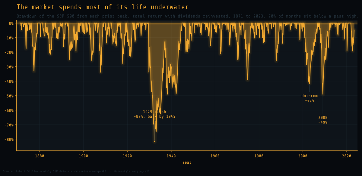
That is the underwater curve. It plots the drawdown from each running peak: zero whenever the market makes a new high, negative every other month, measuring exactly how far below the last high you are. An equity curve hides this because it climbs, and the underwater curve shows it. A chart that spends two thirds of its life below the surface has been painful to hold, and this one spent 69.6% of its months there.
The data is Robert Shiller’s monthly S&P 500 series, 1871 to the present, pulled from the public datasets mirror. It carries price, dividends, earnings, and the Consumer Price Index in one table. The feed publishes the price ahead of the slower dividend and CPI numbers, so the last clean total-return month is June 2023. Every drawdown worth discussing happened before then, so nothing of interest is lost.
Total return, not price, is the honest number
Most drawdown charts you have seen are price only. That overstates the pain, because it ignores the dividends you collected while underwater. So I built a monthly total-return index instead: each month is the price change plus that month’s dividend reinvested at the prior price, chained from 1871. This is the number an actual buy-and-hold investor lived. The total-return index compounds at 9.17% a year nominally over the full window, against 6.90% after inflation.
The distinction is not cosmetic. The famous line about 1929 is that it took 25 years to get back to even, and that is true: on price alone, the September 1929 peak was not reclaimed until September 1954. With dividends reinvested, the same hole closed in January 1945. The dividends bought back almost a decade. The crash was a catastrophe either way, but “25 years” describes a price chart, not a portfolio.
1929 is not in the same league as anything else
Rank the seven deepest total-return drawdowns and one of them stands apart.
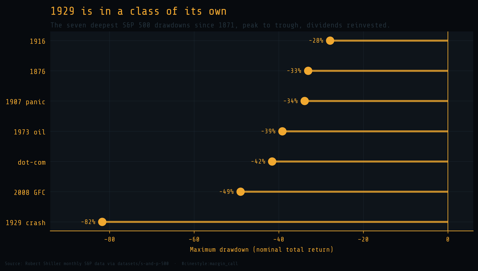
- 1929 crash: 82%
- 2008 financial crisis: 49%
- dot-com: 42%
- 1973 oil shock: 39%
- 1907 panic: 34%
- 1876: 33%
- 1916: 28%
The 1929 collapse took the index down 81.8% from its September 1929 peak to the June 1932 trough. Second place, 2008, lost 49.0%. The gap between first and second, 32.8 points, is larger than the entire depth of the 1916 drawdown, 27.9%. Every other crash in the record clusters between 28% and 49%. 1929 sits alone at the bottom, and that is the figure that should haunt anyone who claims a 50% drawdown is the worst case.
The fall is fast. The climb back is not.
Depth is only half the story. The other half is time, and the two halves are wildly asymmetric.
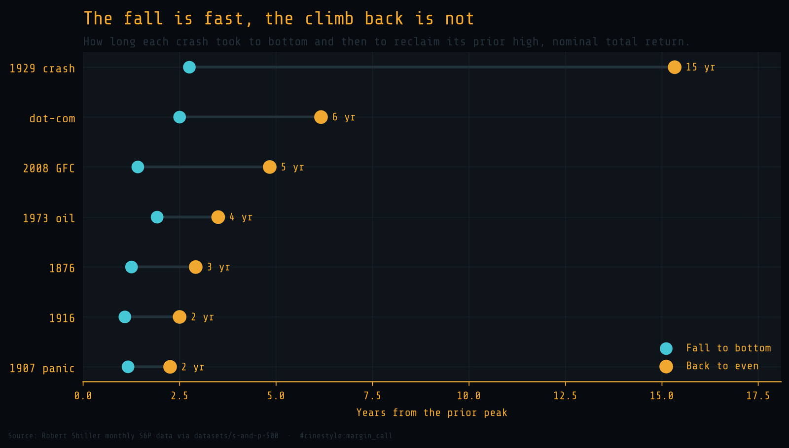
The left dot on each row is the bottom. The right dot is the day you were finally whole again. The 1929 crash reached its trough in under three years but did not reclaim the prior peak, dividends and all, for 15 years total. 2008 fell for 17 months and was back to even 41 months after the bottom, 4.8 years from peak to recovery. The dot-com unwind took six years end to end. The pattern is consistent across the record: markets fall in months and recover over years. Crashes take months, and recoveries take years.
Inflation deepens most holes
So far every number is nominal. Inflation makes the picture worse, because a portfolio that is back to its old dollar value has not won back its old purchasing power. Deflate the total-return index by CPI and most holes get deeper and slower to fill. 1929 is the exception: falling prices made the real drawdown 76.8% instead of 81.8%, and the real recovery arrived in November 1936, eight years before the nominal one.
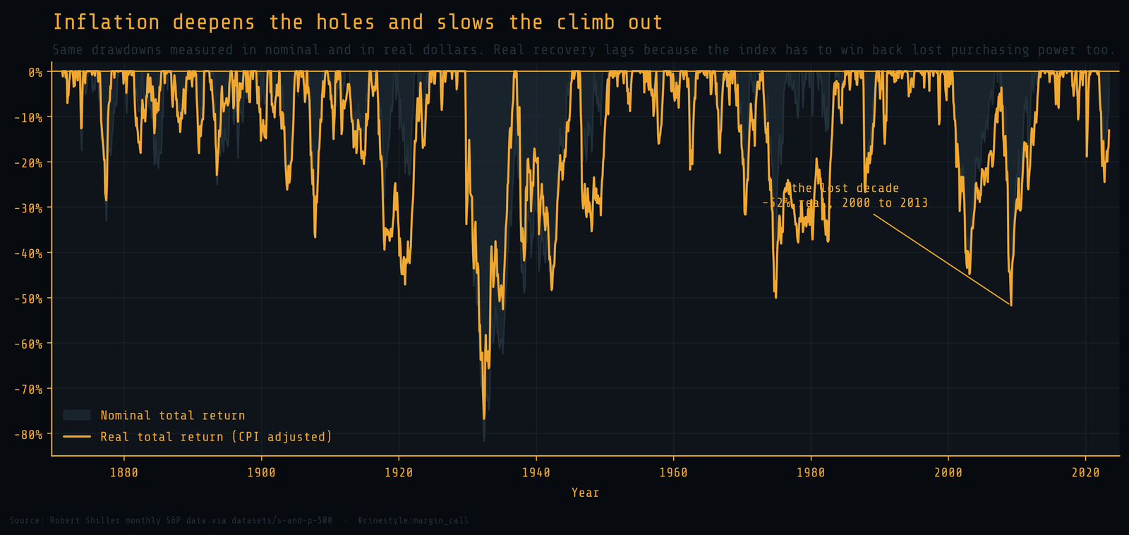
The clearest case is the 2000s. In nominal total return, the dot-com crash and the 2008 crisis are two separate dips with a recovery between them. In real terms they merge into one continuous drawdown. A dollar invested at the August 2000 peak did not recover its real value until May 2013. That is a 103-month descent to the bottom and almost 13 years to break even. Investors of the 2000s call it the lost decade, and the real underwater curve is where you can finally see why. The 1990s investor who assumed stocks always recover quickly spent the next decade being corrected.
What the curve is actually telling you
I went into this expecting drawdowns to be the exception, the rough patches between the good years. The data says being underwater is the default state. The market is at a fresh high in roughly three months out of ten and below a past high in the other seven.
That reframes what holding stocks requires. The 9.17% nominal return is not a reward for buying. It is a reward for not selling during the 69.6% of months when the chart was red and the next high was years away. The crash is what scares people out. The recovery time is what actually empties their accounts, because almost nobody sits through 15 years of underwater to collect the rebound.
Buy the index if you want the long-run return. Just know that the price of admission is paid in patience, and the receipts run a century and a half deep.