// article
Valuation and Returns
What you pay for stocks sets what you earn, and right now you are paying a lot
Valuation does not tell you what the market does next year. It tells you what the market tends to do over the next ten. The cyclically adjusted price/earnings ratio, CAPE, sits at 30 at the last month I can compute it honestly, which is the 94th percentile of its own 142-year history. Starts in the priciest fifth of that history averaged 2.9 percent a year, after inflation, over the following decade.
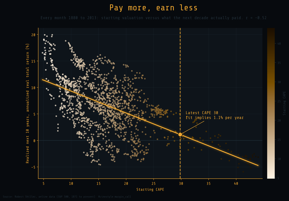
Each dot is one month. Its horizontal position is how expensive the market was that month; its vertical position is what an investor who bought then actually earned, in real terms, over the following ten years. The cloud slopes down. Buy cheap and the next decade pays you well; buy dear and it pays you little. The correlation is minus 0.52, and a single number, starting CAPE, accounts for 27 percent of the variance in what comes next. That is a lot for a market everyone insists is unpredictable.
Building the ratio instead of trusting one
I built CAPE from the raw columns rather than reading the prebuilt one, because the point is to see the gears. The recipe is short. Take the nominal S&P 500 price and deflate it to today’s dollars using the consumer price index. Do the same to earnings. Then divide real price by the average real earnings of the trailing ten years.
The ten-year average is the whole idea. A single year of earnings swings with the business cycle, so dividing price by one year’s earnings makes the market look cheap at the top, when earnings are fat, and dear at the bottom, when they have collapsed. Robert Shiller’s fix was to smooth earnings over a full decade so that one good year cannot disguise an expensive price. My hand-built series runs from December 1880 to June 2023, 1,711 monthly readings.
The data is Shiller’s monthly S&P 500 record, 1,865 rows from January 1871 through May 2026. One honest limit: the feed carries the price forward every month but enters earnings and the price index on a lag, so the most recent rows have no fundamentals. CAPE needs all three inputs, so my series stops in June 2023, the last month with real earnings and a real CPI. I did not invent the missing quarters, so every reading here is at least three years old.
What 142 years of the ratio looks like
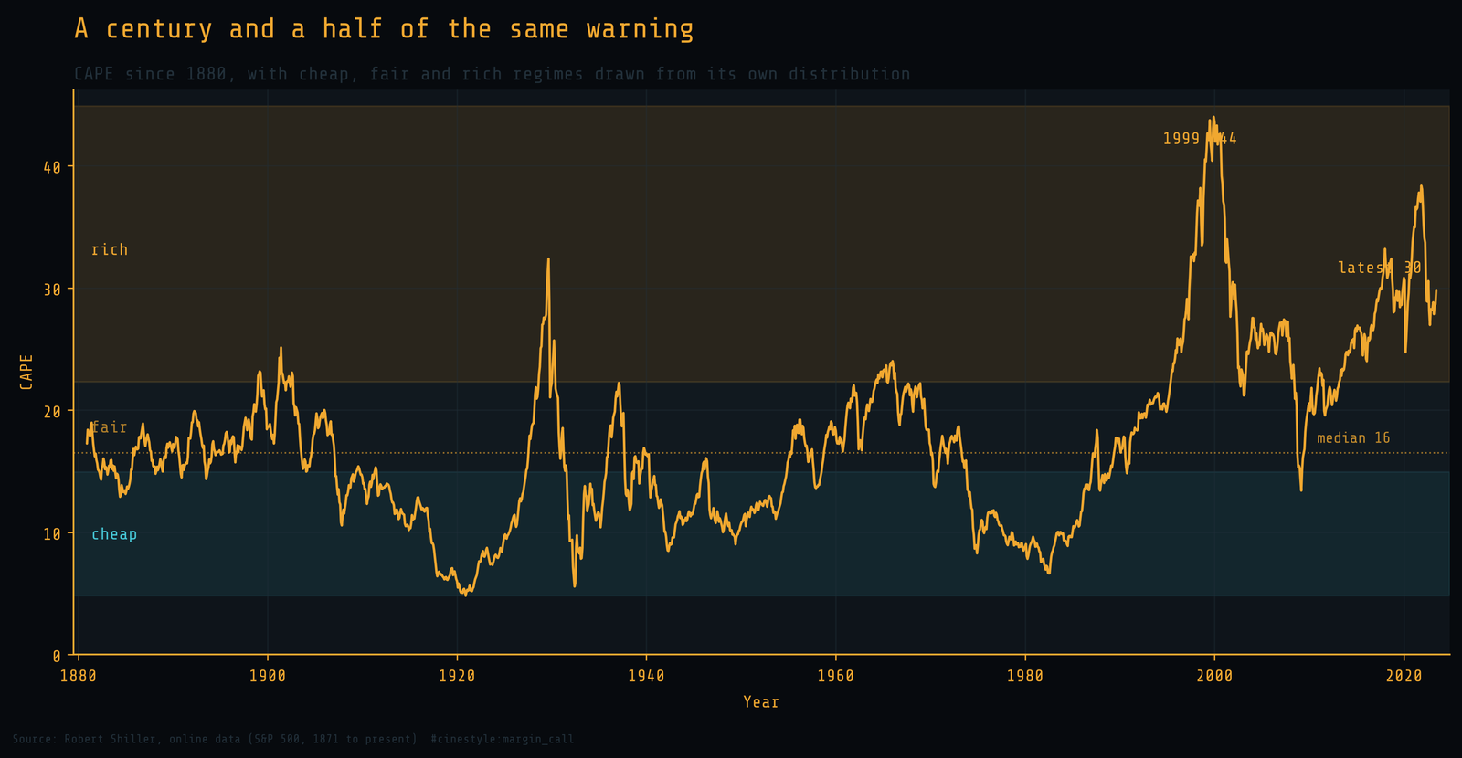
The bands are not opinions. The cheap band is the bottom 40 percent of all readings, below a CAPE of 14.9, and the rich band is the top 20 percent, above 22.3. Both cuts come from the ratio’s own distribution. Three times the line has climbed deep into the rich band and stayed: the late 1920s, the late 1990s, and the present stretch. The 1929 peak is the small spike before the largest drawdown in the record. The 1999 peak of 44 is the all-time high, and the dot-com bust followed within months. The median reading across the whole history is 16.5, and the June 2023 reading is 29.8.
A high ratio is not a sell signal with a date on it. The market spent years in the rich band in the late 1990s before it broke, and an investor who sold in 1996 left real money on the table. Valuation sets the expected level of returns, not the timing of a turn.
Sorting the decades by what they cost going in
The scatter shows the trend; sorting it shows the stakes. I split every starting month into five equal buckets by its CAPE, from the cheapest fifth to the priciest, and measured what each bucket earned over the following decade.
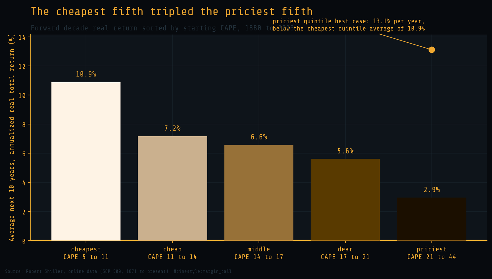
- Cheapest fifth: 10.9 percent per year, real.
- Priciest fifth: 2.9 percent per year, real.
Buying the cheapest fifth of history paid almost four times what buying the priciest fifth paid, in real annualized terms, over the following ten years. The gap is not subtle. It is the difference between doubling your purchasing power in about seven years and taking about twenty-four.
The detail that matters is in the tails. The priciest quintile’s best decade earned 13.1 percent a year, above the cheapest quintile’s 10.9 percent average, so an expensive start can still get lucky. Its worst decade lost 5.9 percent a year, while the cheapest quintile never did worse than plus 1.8 percent. Starting rich did not cap your upside. It opened the downside.
Where that leaves the reading on the desk
CAPE at 30 sits in the priciest quintile, at the 94th percentile of everything since 1880. Run that through the same regression the scatter draws and the fit implies a real total return of about 1.1 percent per year over the next decade. Treat that number as a center of gravity, not a forecast. The scatter around the line is wide: starts in the priciest quintile have earned anywhere from minus 5.9 to plus 13.1 percent a year over the next ten years. The model explains a quarter of the outcome, which leaves three quarters to everything else. The regression also counts fewer independent facts than it looks. Its 1,591 monthly starts run from 1880 to 2013, and their ten-year windows overlap, so the record holds only about thirteen separate decades.
So is the market expensive? By the one measure with 142 years of evidence behind it, plainly yes. That does not mean sell tomorrow. It means the price you pay today has, on average across comparable starting points in the record, bought a thin decade, and a thin decade is the base case to plan around.