// article
Forty Years of Oil Shocks
Forty years of Brent, and the shocks that define it
Oil is a calm market most of the time and a violent one a few weeks per decade. The daily Brent record runs from May 1987 to June 2026, 9,907 trading days, and on a typical one the price barely moves. Then a war or a glut or a pandemic arrives, and the price does in a fortnight what it usually takes years to do.
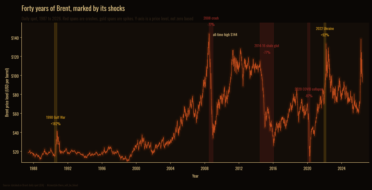
The line above is every daily close. The shaded spans are the six episodes worth naming. Red marks a crash, gold marks a spike, and the y-axis reads a price level, so it starts near the series low rather than at zero. The sections below measure each span.
What counts as a shock
A shock is not a bad day. It is a run, a peak that slides to a trough or a trough that runs to a peak, driven by something you can name. I defined each event by a date window around the real-world trigger and measured the actual peak-to-trough move inside it.
Six events clear the bar. Three are crashes, three are spikes.
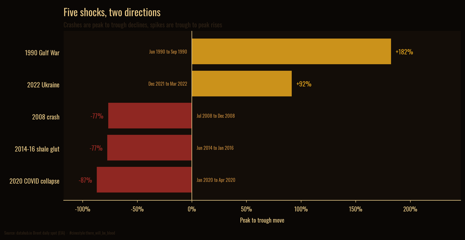
In percentage terms the spikes look larger than the crashes, because a rise has no ceiling and a fall stops at 100%. The 2008 crash erased 76.6% from a July peak of $143.95 to a December trough of $33.73, all inside six months. The 2014-16 shale glut took 77.4% over a longer grind, June 2014 to January 2016, as US shale flooded a market OPEC declined to defend. The 2020 COVID collapse is the deepest single decline in the record: 87.0% from $70.25 in January to $9.12 in April, when demand vanished and there was nowhere left to store the barrels.
The spikes run the other way. The 1990 Gulf War nearly tripled the price, a 182.4% rise from $14.68 in June to $41.45 by late September as Iraq took Kuwait and the market priced a war. The 2022 Ukraine spike added 91.5%, from $69.53 to $133.18 in the weeks around the invasion. The newest spike is the second largest in the record: from $59.93 in mid-December 2025 to $138.21 on 7 April 2026, a 130.6% rise, bigger than 2022 and still short of the 2008 high. Markets pay more attention to barrels that might disappear than to barrels that already have.
Most of forty years has been spent underwater
A price line flatters the asset, because your eye tracks the highs. The honest picture tracks the distance below the highest price seen so far.
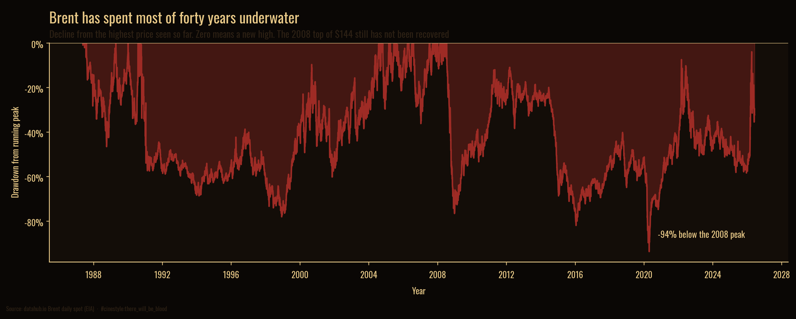
This is a drawdown chart. The line sits at zero only when Brent prints a new high, and dips below the rest of the time. The fill is an area, so it baselines at true zero by construction. What it shows is brutal: Brent spends almost the entire forty years underwater. The 2008 peak of $143.95 is the high-water mark for the whole record, and the price has not closed above it since. At the April 2020 bottom, Brent sat 93.7% below that 2008 high. That bottom, on 21 April 2020, is the same session as the worst single day in the record. A barrel bought at the top of the market would still be deep in the red, eighteen years later.
The chart is mostly red because new highs are rare and declines are the default state. Holding oil has meant long stretches below a prior high, with brief returns to the surface.
The returns do not come from a bell curve
This part changes how you should think about risk. Take the daily percentage changes and the average is almost nothing, 0.05% per day, with a standard deviation of 2.51%. Annualized, that is 39.9% volatility, which is already high. But the standard deviation hides the real danger, because the moves are not normally distributed.
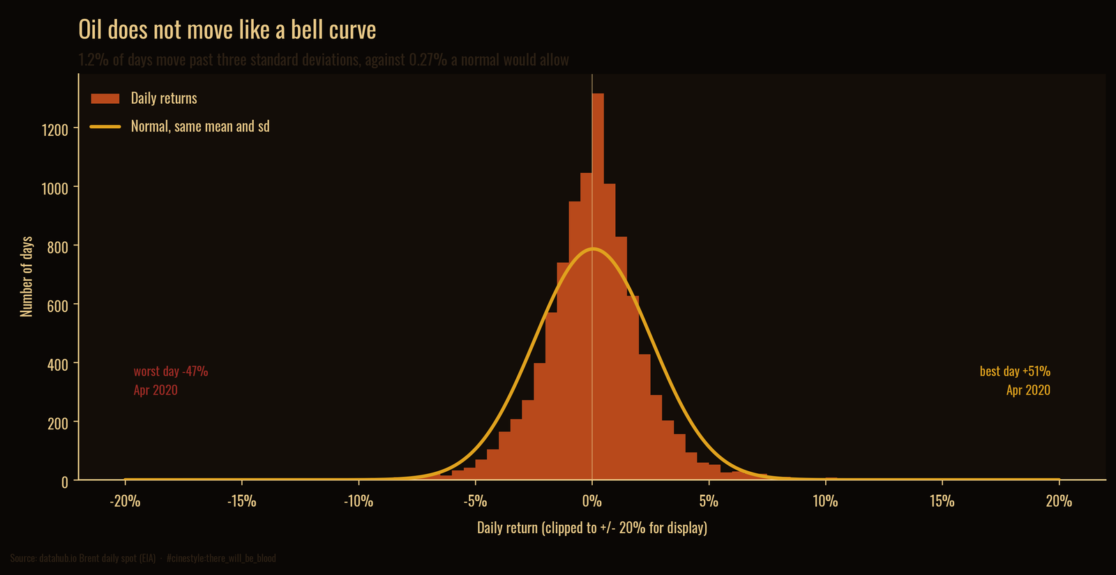
Picture the bell curve as a tent with the canvas pulled tight. The real distribution is a tent pole shoved up through the middle, with the canvas torn at both edges. The center is taller than normal, the shoulders are thinner, and the tails are far fatter than the curve allows. A normal distribution puts 0.27% of days beyond three standard deviations. Brent puts 1.18% there, more than four times as many. Past five standard deviations, where a normal predicts essentially nothing, Brent still spends 0.28% of its days. The excess kurtosis is 42.7, a number that means the tails dominate. The skew is only 0.25, so the fat tails run in both directions rather than mostly down.
The extremes are real and recent. The worst day in the record fell 47.5% on 21 April 2020, the day the front-month futures contract chased physical storage toward zero. The very next day, 22 April 2020, Brent rose 51.0%, the best day in the record. The worst and best days in forty years sit back to back. Monthly returns tell the same story at lower resolution: monthly volatility is 12.1%, the worst month was minus 71.1% in March 2020, and the best was plus 88.6% in May 2020. A normal model fails in the tails, where the losses are.
What one spot series cannot see
This is one price series, Brent spot, the European benchmark. WTI, the US grade, has its own quirks, and the April 2020 episode was sharper in WTI futures than in Brent spot. The dataset is daily closes, so it cannot see what happens intraday, and the deepest panics are intraday events. The shock windows are mine, chosen around known events, and the exact percentages depend on where I drew them. None of that moves the shape. The fat tails, the long stretch underwater, the back-to-back record days in 2020, all of it survives any reasonable redrawing of the lines.
I came to this expecting a story about averages and trends. The averages turned out to be the least interesting thing in the file. Oil is priced by its disasters, and the bell curve never sees them coming.