// article
A World Map of Drinking
A world map of drinking, and what the colors give away
Where you live goes a long way toward predicting what is in your glass. The FiveThirtyEight alcohol table covers 193 countries, and once you put it on a map the pattern is not subtle. Beer, wine, and spirits each own a part of the world, and the borders between them are old.
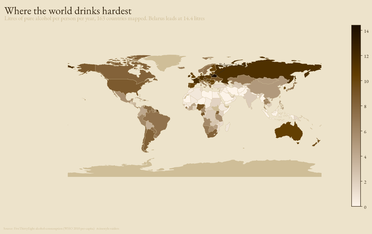
That map shades each country by total pure alcohol per person per year. The dark band runs straight across Eastern Europe and into Russia. Belarus sits at the head of it, 14.4 litres a year, the heaviest-drinking country in the table. The pale countries are the Muslim-majority belt across North Africa, the Middle East, and South Asia, where the number drops to zero. The world average is 4.7 litres. The top ten all clear 11.
The data is one row per country with four numbers: beer servings, spirit servings, wine servings, and total litres of pure alcohol, all per capita from the WHO 2010 figures. The table has no time dimension. It is a snapshot, and a snapshot is enough to see the belts.
One definition matters for everything below. FiveThirtyEight counts a serving as a can of beer, a glass of wine, or a shot of spirits, so a serving is not a fixed amount of alcohol. I call a country’s dominant drink the one with the most servings, and the 13 countries with zero servings of anything get no dominant drink at all. That is a count of drinks poured, not of alcohol consumed.
What wins where
Switch from how much to what kind and the map sorts itself into three blocks.
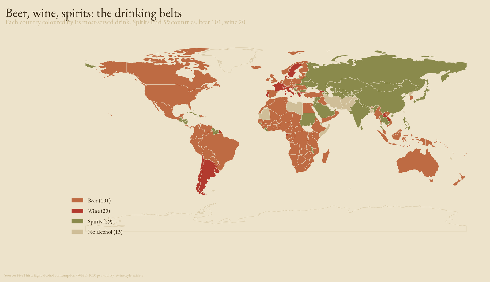
Color each country by its most-served drink and the result is three continents of habit. Beer leads in 101 countries, more than half the table: the Americas, most of Africa, Australia. Spirits lead in 59, and they cluster, the post-Soviet bloc, a stripe through East and Southeast Asia, a scatter of Caribbean islands. Wine leads in just 20, and you can almost draw the old Roman map from them, France, Italy, Portugal, the Balkan coast, Argentina, Chile. Thirteen countries report zero servings of anything.
The belts are not about taste alone. My guess is that climate explains part of the map: spirits travel and store well in cold places where grapes will not grow, beer follows grain agriculture, wine follows the latitude where vines thrive. The data holds no climate variable, so I cannot test that, and it cannot explain the dry belt, which follows religion.
The heaviest drinkers, and the world average they leave behind
The total-alcohol leaders are worth ranking on their own, because the gap between them and everyone else is large.
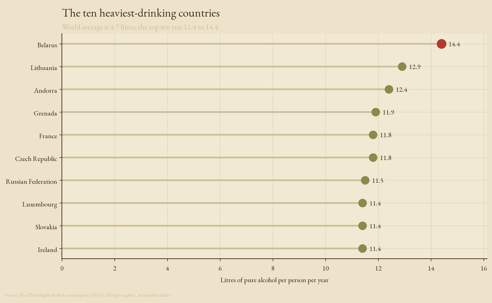
Belarus tops it at 14.4 litres, then Lithuania at 12.9 and Andorra at 12.4. The bottom of this top ten, Ireland, still reads 11.4. Every one of these countries drinks more than twice the world average of 4.7. Nine of the ten are European, and the one that is not, Grenada, is a rum economy in the Caribbean.
A ranking flattens the interesting part, which is that these ten reach the same height by very different routes. Belarus gets there on spirits, France on wine, Ireland on beer. The totals match; the contents do not.
Same height, different glass
So the last view holds the total roughly fixed and looks at the mix.
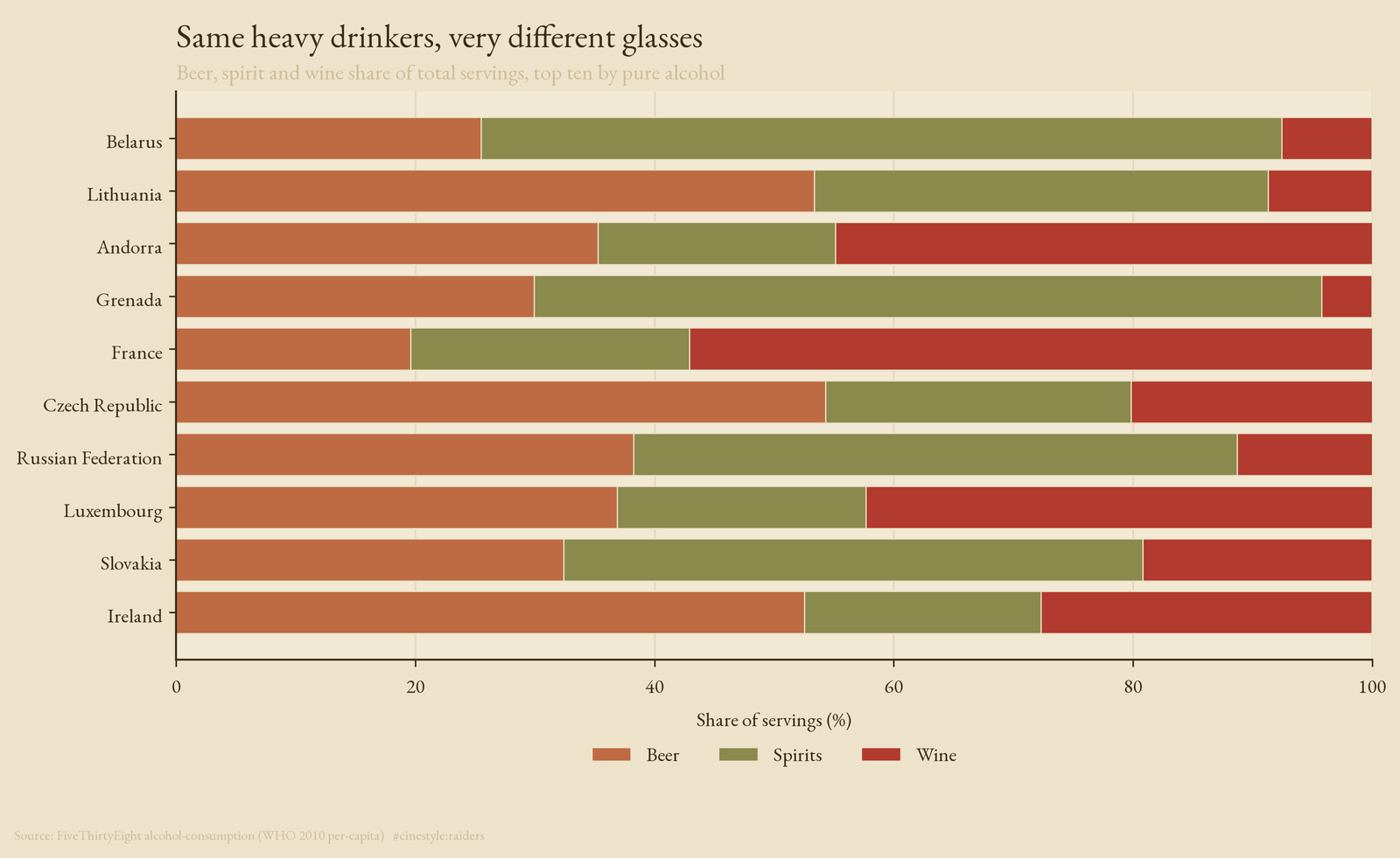
This is the same ten countries, each bar normalized to its share of servings. All ten sit between 11.4 and 14.4 litres, and inside that band the mix splits almost evenly. Four lean spirit: Belarus, Russia, Slovakia, and Grenada. Three lean wine: France, Andorra, and Luxembourg. Three lean beer: Ireland, Lithuania, and the Czech Republic. The extremes are lopsided. Belarus pours 373 servings of spirits a year against 142 of beer. Ireland pours 313 of beer against 118 of spirits. France pours 370 of wine against 127 of beer. Similar totals hide three different glasses.
The single-drink records make the same case at the extremes. The heaviest beer country is Namibia at 376 servings. The heaviest wine country is France at 370. The heaviest spirits country is Grenada at 438. None of the three is the overall leader, because being the hardest-drinking country and being the most committed to one drink are different achievements.
What a snapshot misses
This is a 2010 snapshot, and national drinking habits have shifted since. It is also per capita across the whole population, so a country with many abstainers and a hard-drinking minority reads the same as one where everyone drinks moderately. And the map drops countries: 30 of the 193 rows are microstates and island nations that the 110m Natural Earth layer does not carry, so Grenada, Andorra, and the Caribbean rum islands appear in the rankings but not on the world map. The 163 countries that do map are enough to show the belts; the missing ones are too small to see at world scale anyway.
I expected a story about how much and found one about what. The drink a country reaches for tells you where it sits on the old map of grain and grape, and that map is sharper than any ranking of litres.